Introduction to QGIS
Course Summary
Introduction
This course provides an introduction to working with geospatial data in QGIS for data scientists and those new to GIS and geography.
Estimated time for course
2-3 hours
Audience
Data scientists working with location data.
Course Aims
By the end of the course you will know how to:
- Navigate QGIS User Interface
- Create, save, and customise a QGIS project
- Import and export tables and spatial data to and from QGIS
- Use basic GIS tools to process geospatial data
- Edit geospatial data and perform a basic analysis
- Style layers to visualise the underlying data
- Create a basic geospatial data visualisation
Requirements
- We recommend completing the Practical Geography for Statistics training prior to starting this course.
- Beginner/Intermediate knowledge of data science operations.
Data for this project can be found in this repo under _docs/intro_to_qgis/edinburgh_data.
Click on the Code button and download the zip file. The zip file will download to your download folder, double click on the zip file and then ‘geospatial-training-master’. There are other geospatial courses included in the zip file; navigate to the intro_to_qgis folder within _docs and copy the folder.
Create a new folder on a network share with a name of your choice and save the folder you copied from the zip file within the new folder. The copied folder will contain the data required to complete this course.
Any image files within the folder are not required and may be deleted.
QGIS Basics
This first module will cover the basics of using QGIS: including basic user interface (UI) elements, project setup, loading data, and some basic functionality.
Loading QGIS
Before loading QGIS, please check your version number. This tutorial will use QGIS 3.28.11.
To open QGIS, click on QGIS Desktop. Upon opening QGIS, you should be met with a screen similar to that below:
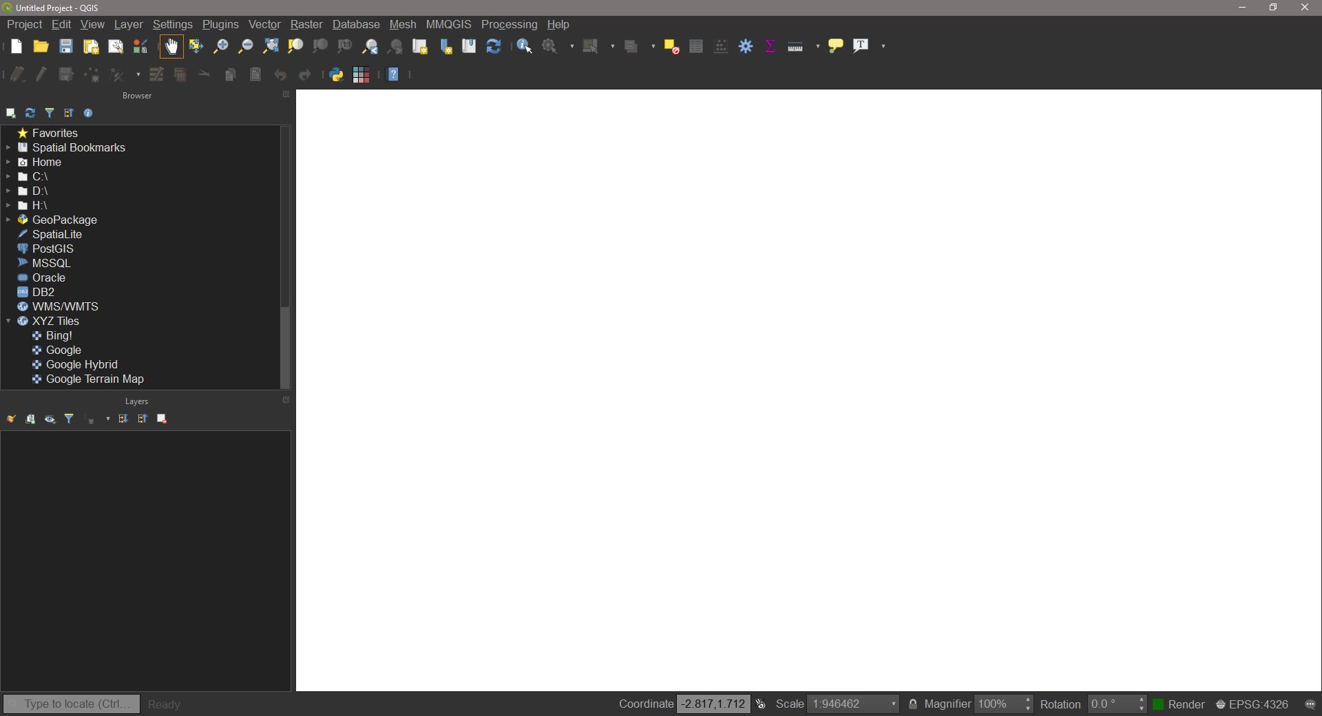
UI elements
Menus
At the top of the QGIS window are a number of menus. Clicking on one will reveal a further dropdown menu. Some of these dropdown elements also have their own dropdowns etc. For example, expanding View reveals a number of options to customise the current view and UI, and some of these options have further options signified by an arrow.
Toolbars and Panels
Toolbars are collections of easy-access functions, grouped under a parent family of functions. The toolbars appear as the rows of icons below the menus. These toolbars can be moved around by dragging on the three vertical dots to their left. Hovering the cursor over an icon will display a tooltip with the name of the tool and any keyboard shortcuts for it.

The following table summarises some of the most useful buttons in these toolbars:
| Icon | Description |
|---|---|
| `New Project`, `Open Project`, and `Save Project` | |
 |
`Pan Map` and `Pan to Selection`. `Pan to Selection` will centre the map view on the selected feature(s) |
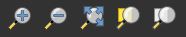 |
`Zoom In` and `Zoom Out` will zoom either a fixed amount on click or to an extent from click+drag. `Zoom Full` will zoom to the maximum extent from all layers. `Zoom to Selection` and `Zoom to Layer` will zoom to the extent of the selected feature or selected layer, respectively. |
 |
`Identify Features`. Clicking on a feature with this tool will open the 'Identify Results' panel, displaying attribute information for the highlighted feature. |
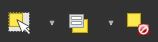 |
`Select Feature by area or Single Click` will allow the selection of features by either clicking on one feature or doing a click+drag to select multiple. `ctrl+left click` can also be used to click select multiple features at once. `Select Features by Value` will open a new dialogue to select features based on values of the attribute table (see: 'Selecting Features'). |
 |
`Open Attribute Table` for the selected layer. |
 |
`Open Field Calculator for the selected layer (see: 'Field Calculator'). |
 |
By default this will be `Measure Line` to measure the distance between two points in the map view. The arrow next to the icon opens a dropdown menu. Using this tool will open a window to display the measurements, where units can be chosen. `Measure Area` allows the placing of multiple points to calculate an internal area. Right clicking will complete the area. `Measure Angle` two clicks on the map will draw a line. The angle displayed will be between this line and the line from the last point to the the cursor. |
The buttons on the toolbar can be chosen by going to View > Toolbars and toggling options. For this course, make sure Project Toolbar, Map Navigation Toolbar, and Attributes Toolbar are enabled.
Not all of these buttons are used often, whereas some will be used in every project. Try clicking on each available toolbar button to see what it opens and familiarise yourself with their names.
Panels are parts of the UI which organise a variety of features into larger groups. These features often directly interface with any maps displayed.
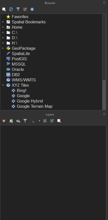
The layers panel displays all data loaded into the current project. The order determines what renders on top of what: layers at the top of the panel will be on top of layers below. These layers can be moved around by clicking and dragging, or edited by right-clicking and choosing an option e.g. renaming. Clicking the  symbol will toggle the visibility of that layer in the main view.
Before we begin any work, it’s a good idea to set up the UI such that everything needed will be easily accessed. For now, we will add an additional panel for quick access to all QGIS functions.
To do this, go to View > Panels and check Processing Toolbox. You should now have a panel on the right side of the screen called ‘Processing Toolbox’. This panel contains a list of all tools available in QGIS and a search bar to find them. This will be the primary method for finding tools in this tutorial, although some tools can also be found from the menu bar. For example, the Buffer tool can also be found by going to the menu bar and choosing Vector > Geoprocessing Tool > Buffer. This is the same tool as you would get by searching Buffer in the processing toolbox.
Loading data
Loading data into QGIS is straightforward. The simplest way is to drag and drop any delimited text or spatial files straight into the program, where they can be loaded in as layers. There are some potential nuances, however, in what to do when dropping data in. Before loading any data in make sure it is not in a .zip folder. If it is, unzip it first then load it in. Do this for all of the data in the supplied ‘edinburgh data’ folder.
Delimited Data (non-spatial)
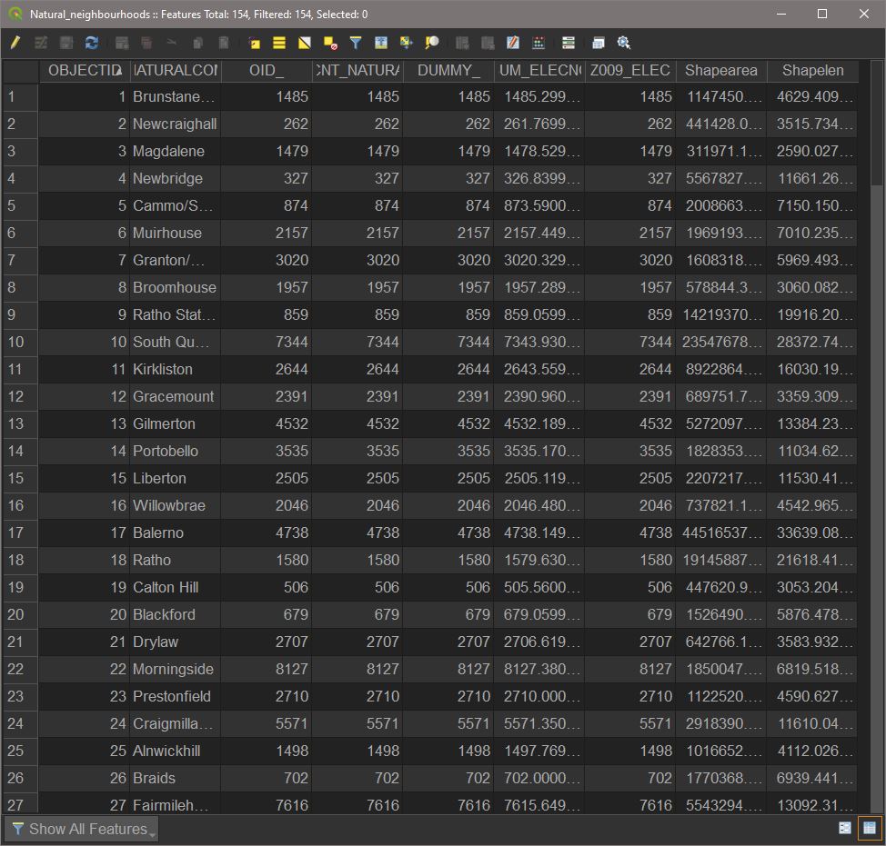
Text delimited data (.csv, .txt, .xlsx) can be simply dragged and dropped in. Upon doing so, it will appear in the Layers panel. As this data is not in a spatial format (unless converted to one later), it can only be explored by opening the attribute table. Try doing this for ‘edinburgh_trees.csv’ by either right-clicking and choosing Open attribute table, or by using the toolbar. The attribute table looks just like a normal spreadsheet; however it cannot be edited right away (we’ll come to editing later).
Spatial Data
Different kinds of spatial data format have slightly different ways of loading in.
Shapefiles (.shp) come with a number of auxiliary files such as .dbf, .dbx etc. These files do not need to be dropped into QGIS; only the .shp needs to be. However, a shapefile’s auxiliary files should always be kept with it, so it’s usually a good idea to have each set of files in their own folder rather than loosely mixed. We’ll now load in the ‘Natural_neighbourhoods.shp’ file into our QGIS project. Drag and drop the shapefile (.shp) into QGIS. The layer will be displayed in both the layers panel AND the main window. We can still see the attribute table, however, using the same method as for the delimited layer.
A geodatabase (.gdb) and a geopackage (.gpkg) are similar formats. Both are essentially specialised folders which contain both spatial data and their auxiliary information in one place. Dragging and dropping in a geodatabase or geopackage will do one of two things, depending on contents. If there is only a single layer in the file, it will be loaded straight in. Otherwise, a dialog will appear asking which layers we would like to import and if we would like them to be grouped together.
Layers and Feature Types
In QGIS, the Layers panel displays the names of all data loaded in the current project. Layers contain features, which are generally one of three things: Tables, basemaps, and geometries.
There are three geometry types most commonly used in GIS: points, lines, and polygons.
Points represent a single location, with X and Y coordinates and potentially some associated data for each point. Points do not have spatial dimension, only position. As such, QGIS will by default display points as circles with a fill colour and outline. This symbol representation of the points will remain at a constant size relative to the screen as you zoom in and out.
Lines represent connections between points. A line feature can be a single line with nodes and one beginning or end, but can also branch and have multiple end points. What defines it is the point nodes and connections between them. As the line features are effectively one dimensional, points will only intersect a line if they lie directly on one another. The symbol representation of the line does not represent the extent of the line, which is one-dimensional and does not have true width.
Polygons, unlike lines and points, do have two-dimensional area. Polygons have a boundary separating the ‘inside’ from the ‘outside’. Polygon features can intersect other polygons, lines, and points anywhere on or within the polygon boundary. The symbology for a polygon is made up of an internal ‘fill’ and an ‘outline’ for the boundary.
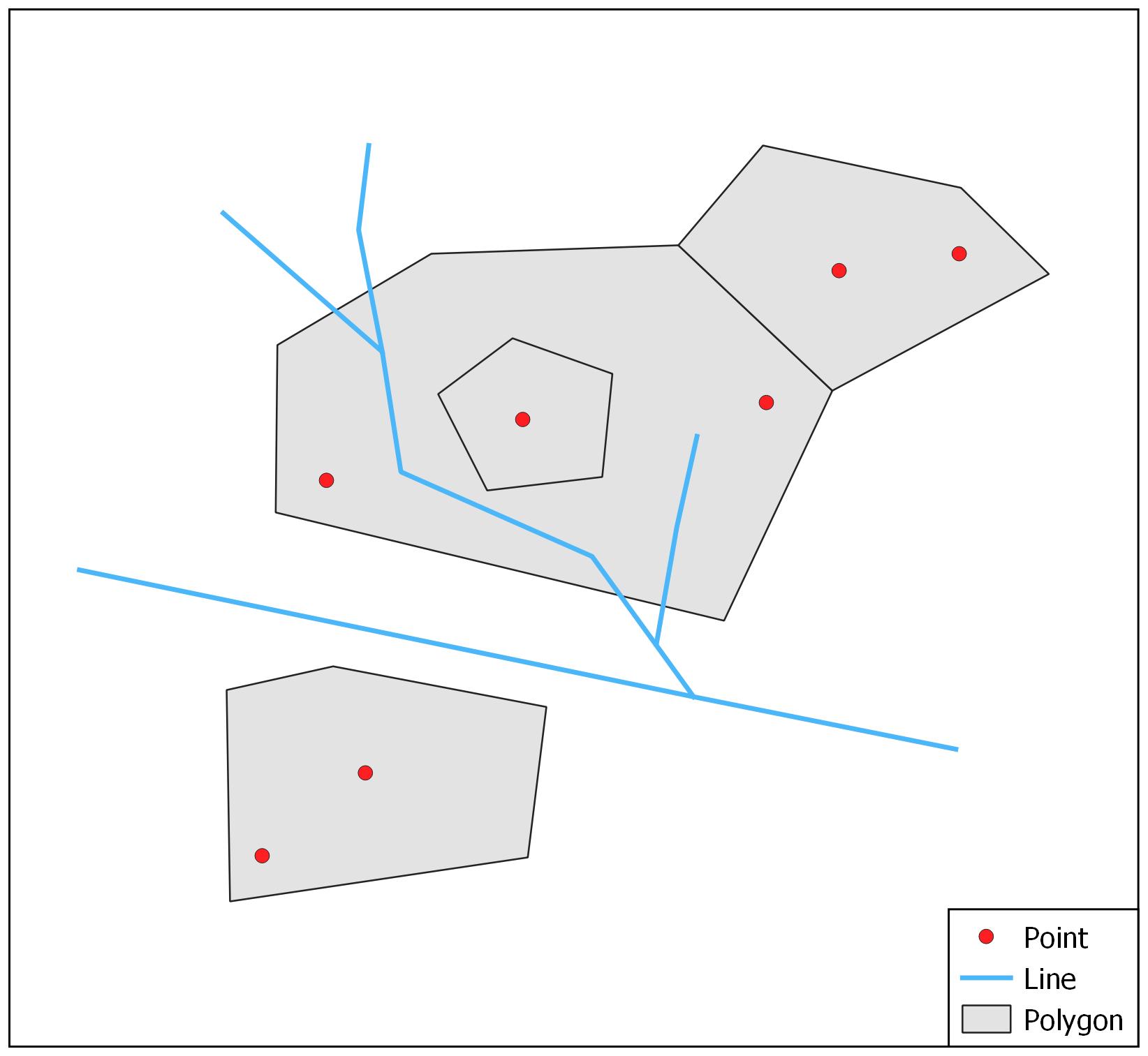
All of these features can either be made up of a single part or multiple parts. The figure below, for instance, shows how by basing symbology on the values of an attribute we can visually separate the geometries from one another.
Selecting Features
The Select tools can be used to select features by hand or by a query. Many tools have an option to apply their operations to selected features only. This is useful if we have a large spatial dataset which could take a long time to process, and it might take multiple attempts to refine the use of the tool.
Select by area or single click
Firstly, let’s try Select features by area or single click from the Attributes Toolbar. With this tool active we will be able to select features for the active layer. Left clicking will select one feature at a time. Try selecting different polygons in the ‘natural neighbourhoods’ layer. Notice that upon selecting a new feature, the previously selected one is deselected. If we want to select multiple features at once, we must hold ctrl while clicking.
Clicking and dragging will select features which intersect with the rectangle drawn. This is a quick and rough way of selecting many features at once if, say, we don’t need to worry about any specific one but instead all those in a general area.
Select by value
With the trees layer active, open the Select features by value field. This will open a dialogue window with the names of each of this layer’s fields and query boxes next to them. If we know the specific term we want to select by, we can enter this into the relevant query. Open the attribute table for this layer too. Copy one of the values in ‘LatinName’ into the Select features by value window in the relevant query box ‘LatinName’ and press OK. Now we can see that multiple points have been selected. These will all have the chosen ‘LatinName’ attribute.
Multiple fields can be used at once to further refine the selection. Have a go at selecting by different combinations of attributes for different layers.
When finished, press Deselect features from all layers to deselect everything.
Project Settings
Project CRS
Each project uses a ‘Coordinate Reference System’ (CRS). This essentially determines where the X and Y coordinates are placed with respect to a given ‘origin’. A CRS will have a name and standard code (EPSG:XXXXX) . For most purposes, the project CRS will either be Universal Transverse Mercator (WGS84, EPSG: 4326), or some kind of National Grid. OSGB British National Grid (EPSG: 27700) is the CRS of choice for projects set in Great Britain. The origin of this coordinate system is located in the southwest of the British Isles. British National Grid is actually a PROJECTED coordinate system, which uses ‘Eastings’ and ‘Northings’ instead of Longitude and Latitude.
As these tutorials will use data for Great Britain, we will need to set the Project CRS to British National Grid. To do this go to Project > Properties > CRS. Now, in the Filter bar search for either ‘British National Grid’ or ‘27700’ (the EPSG code). Now select the result in the ‘Coordinate Reference System’ box and press OK.
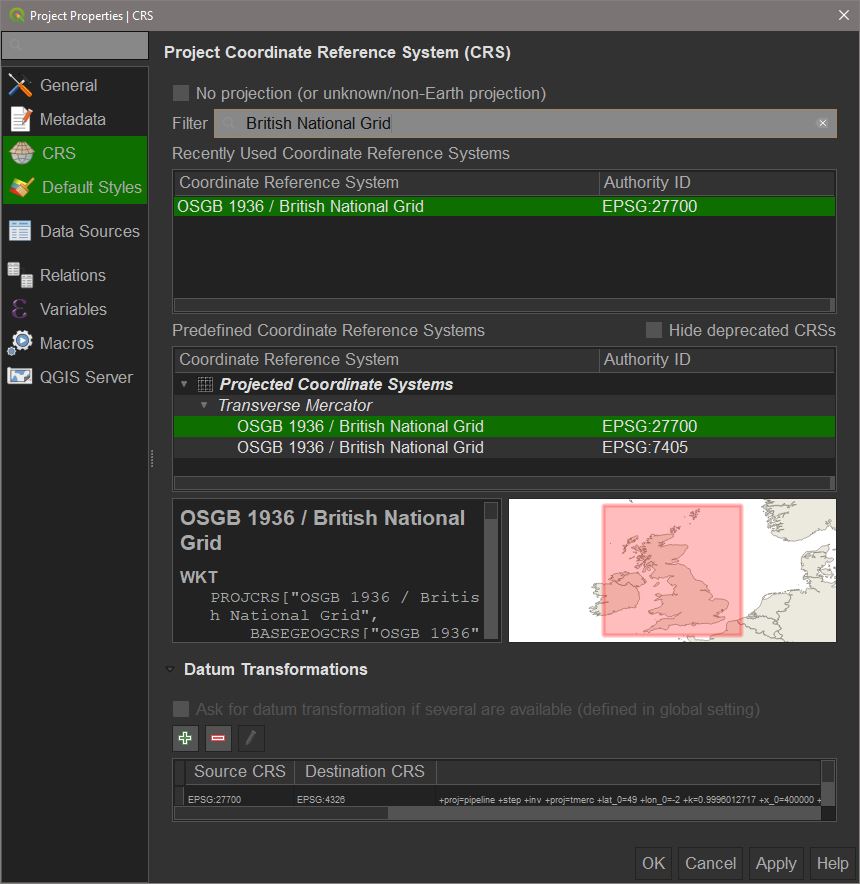
The project will now use BNG as the CRS. This means that any spatial data with coordinates defined in BNG will be displayed as intended with spatial relationships between points preserved. Data NOT in BNG will be automatically projected if the original CRS is also defined. If data does not have a CRS already defined, we would have to do that manually.
Basic QGIS Tools
This tutorial will cover the tools needed to complete a basic analysis in QGIS. The data we will use is from Edinburgh City Council. It has been edited from the original source to make it suitable for a basic analysis, and extraneous attributes have been removed.
QGIS uses a form of temporary layer called a ‘scratch layer’. These will have the  symbol next to them.
A scratch layer can be renamed, reordered, visualised, or edited just like any other layer however these layers are temporary and are lost when the project is closed. Scratch layers are the default outputs for all tools, and so will be created during the course of this tutorial. Try to name these scratch layers appropriately to keep things organised e.g. ‘original_name_toolused’. We will cover making these layers permanent in Editing and Saving Data.
Data Tools
These tools apply specifically to non-spatial data. Often data will not be provided spatially, and it must be manipulated to suit a spatial analysis.
Joins
A non-spatial join allows us to connect two tables to each other according to a specified attribute. The most commonly used, and the one we will use now, is a left-join. Just as on a normal table in any other software, a left-join in QGIS will produce a new table with columns between the two inputs tables matched by feature (rows).
To perform a non-spatial join, go to the processing toolbox panel and search for Join attributes by field value.
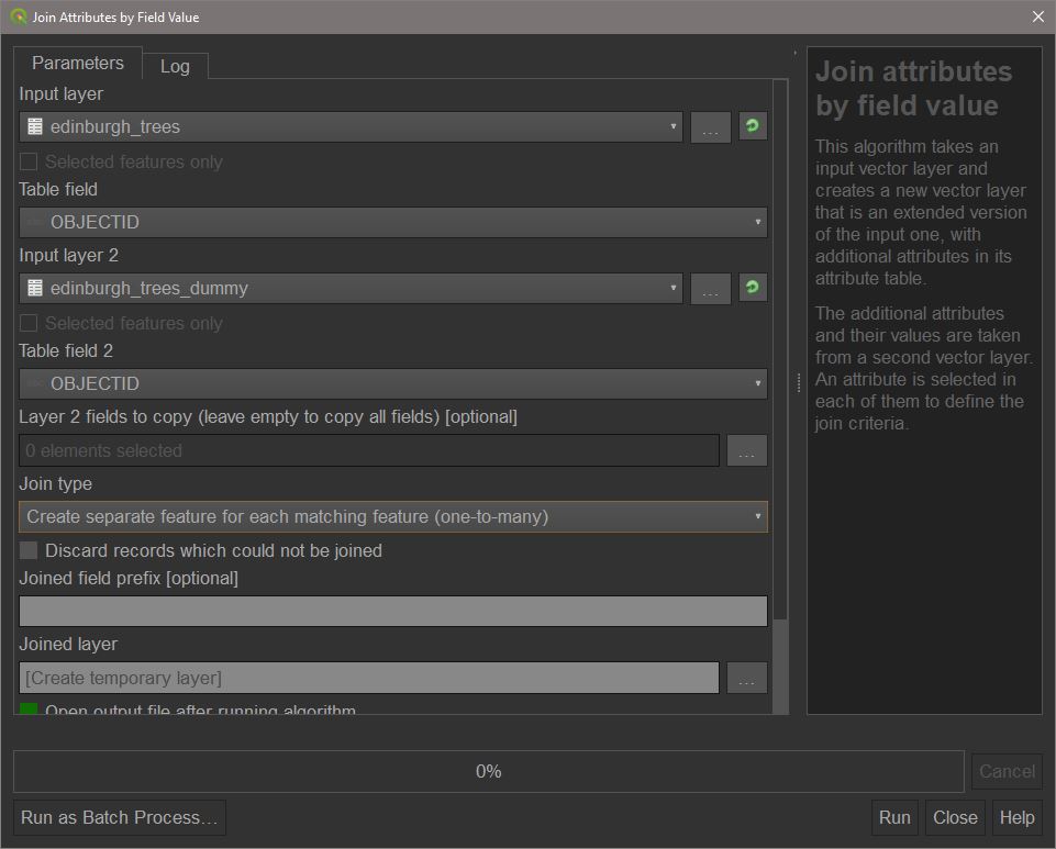
Choose ‘edinburgh_trees’ as input layer 1, and ‘edinburgh_trees_dummy’ as input layer 2. Set the join type to ‘one to many’.
Table to geometry
Data will not always come in a spatial format. Here, we have the locations of trees as a csv file, with columns for the X and Y coordinate. This table can be converted into a point geometry, with all other attributes retained, with the Create points layer from table tool.

Set the input layer as ‘edinburgh_trees_join’. The X and Y coordinates to ‘Easting’ and ‘Northing’ respectively, and the CRS to ‘BNG’/’EPSG 27700’. After running, we will now have the trees represented as points in the central view window and as a points layer in the ‘Layers’ panel.

If the points layer is below ‘Natural neighbourhoods’, move it to the top. Rename the points layer to ‘edinburgh_trees_points’.
Refactor Fields
Refactoring fields allows us to change how the software interprets field values. Search Refactor Fields in the toolbox and open it. Use ‘edinburgh_trees_points’ as the input layer. If prompted to, choose to reload the field mapping. We can now see what type has been assigned to each field. Right now, all fields are of type String. This means QGIS will interpret these values as text, including numbers, and will not be able to use them to perform numerical operations. To fix this, we can simply select the drop-down menus for the ‘TREE_HEIGHT_AV’ and ‘TREE_SPREAD_AV’ fields and change the type to Double.

Once you’ve done this, run the tool and name the output ‘edinburgh_trees_points_refactored’. We can now begin to use spatial and numerical operations on our data. If you are happy that you have followed these steps correctly you can now remove the other edinburgh_trees layers by right-clicking and choosing Remove layer....
Vector Tools
Fix Geometry
Often spatial data will contain geometry errors due to problems during digitisation or changes of data format. For example, a polygon may not be properly closed or can overlap with itself. QGIS will fail to complete a process if it detects a geometry error. For example:

To prevent this there is the Fix geometries tool. Open this from the toolbox.

Select the ‘Natural_neighbourhoods’ layer as the geometry we would like to fix and press run. It may take some time depending on your computer, but the end result will be a layer called ‘fixed geometries’. Rename this to ‘edinburgh_natn_fixed’. This is now our fixed, error-less natural neighbourhoods layer which we’ll use going forward, so feel free to hide or remove the original layer.
Buffer
A buffer is one of the simplest and most useful tools in GIS. A buffer will produce a polygon feature which extends from the input feature out to a specified distance. The input feature can be a point, line, or polygon, but the output will always be a polygon.
To demonstrate on points, we will use the refactored trees layer. A single point is not a good physical representation of a tree, which will have a spread. Say the council wished to calculate an approximate area of tree coverage, they would need to have a polygon representation of the trees. By using the buffer tool, we can do this calculation. Search for Buffer in processing toolbox.
Now, set the input layer to your trees point layer. Set buffer distance to 10. This will automatically be in metres as that is the standard geographic unit of the project CRS. Run the buffer.

The result is that each point now has a circular polygon drawn around it. The radius of this circle is the buffer distance. However, nearby points overlap but are still separate polygons. This can be useful if each individual point was a unique event we cared about, for example if we wanted to see the predicted radius of pollution from factories and know the area covered for each one individually.

However, we want to know the total area covered by the trees, and these overlaps will result in double counting. To prevent this, we can use the Dissolve result option. Open the buffer window again and use the same options as before but with Dissolve result checked. Running it now yields a single polygon with overlapping areas merged into the overall polygon. Opening the attribute table for this new layer there is now a single row, representing a single feature. Using the ‘information’ tool from the toolbar and clicking on the layer will show some geometric information for this layer including the area in square meters.

The non-dissolved layer may also look very similar to the original points layer, however zooming in and out will not resize the tree symbology, whereas with points they will scale according to zoom.
Dissolve
As part of the buffer tool, we saw how ‘dissolving’ the result can lead to individual features being merged into one. This can be applied on its own to a feature with the Dissolve tool. As before this will merge all features of a layer into one but can also merge features into groups based on shared attributes. To demonstrate, we will dissolve the Natural Neighbourhoods layer into a single polygon. Select the Dissolve tool from either the Processing Toolbox or by using the Vector > Geoprocessing > Dissolve menu.
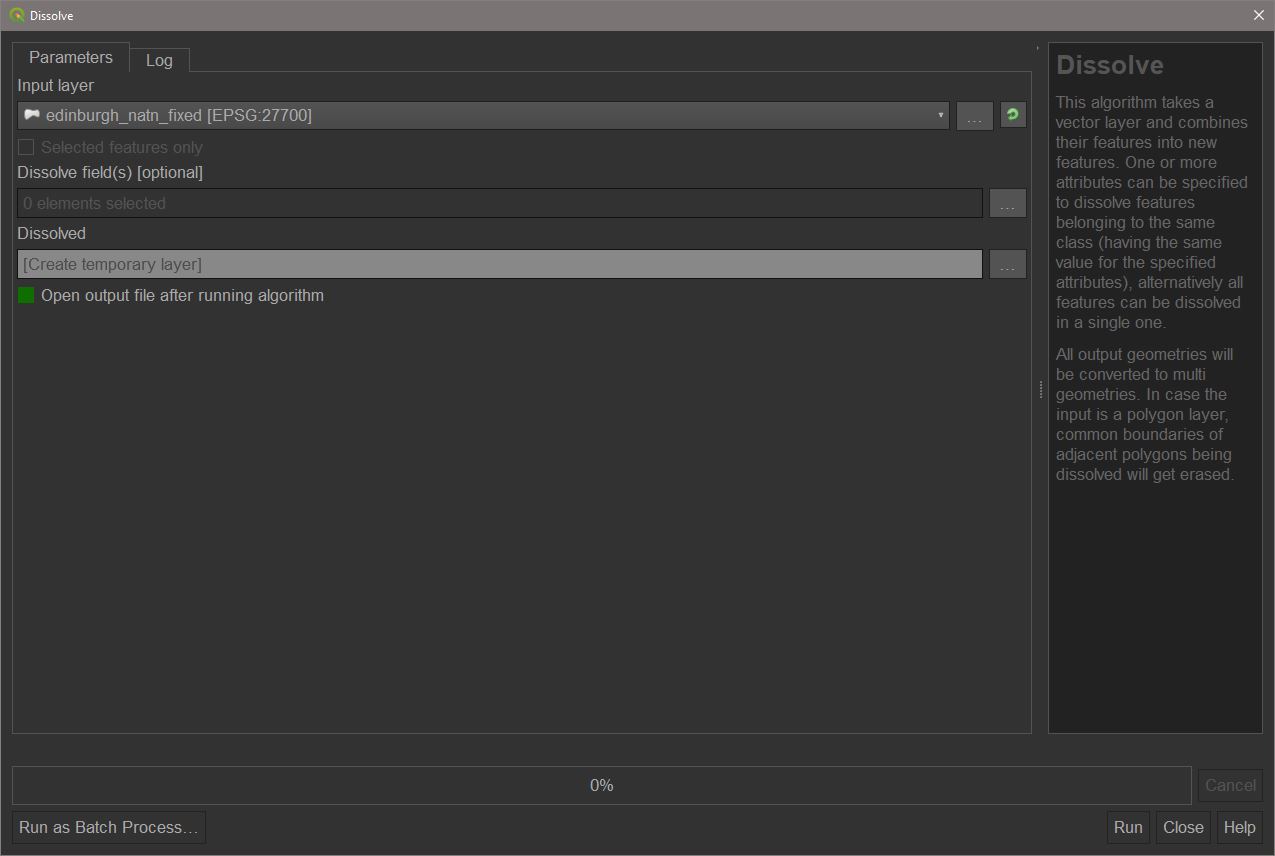
With ‘edinburgh_natn_fixed’ as the input press ‘run’.
The result is a single polygon feature. Inspecting the attribute table will also reveal this. Unlike Union, a dissolve will attempt to resolve internal borders and therefore will not produce overlapping features. This does mean, however, that dissolves can be computationally slow if there are a lot of detailed or overlapping internal borders.
Clip
Clipping is a very useful feature in QGIS which removes features of an input layer which are outside of an overlay polygon layer. This is useful if we want to simply remove geometries outside of a given area without doing any joins and is therefore a quick way to eliminate geometries for visualisation.
Some of the edinburgh tree points are outside of the Natural Neighbourhoods layer. From the processing toolbox, find and open the ‘Clip’ tool or go to Vector > Geoprocessing > Clip. Select ‘edinburgh_trees_points_refactored’ as the input layer and ‘edinburgh_natn_dissolve’ as the overlay and press Run.
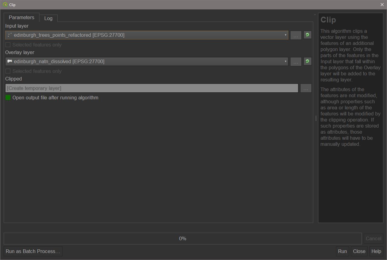
The output will be a points layer containing only those trees which are inside the boundary of the natural neighbourhoods layer. Name this new points layer ‘edinburgh_trees_clipped’.
Spatial Joins
Probably one of the most useful spatial operations, and one of the most commonly used. A spatial join acts similarly to a non-spatial join, however it will join tables based on their location instead of shared attributes. A number of options are available for a spatial join. For our purposes, a simple ‘intersect’ is all that is necessary. Also, as we are primarily interested in the data linked with the spatial features, we will want to create summaries from the joins. To achieve this, we will use Join attributes by location (summary) from the processing toolbox.
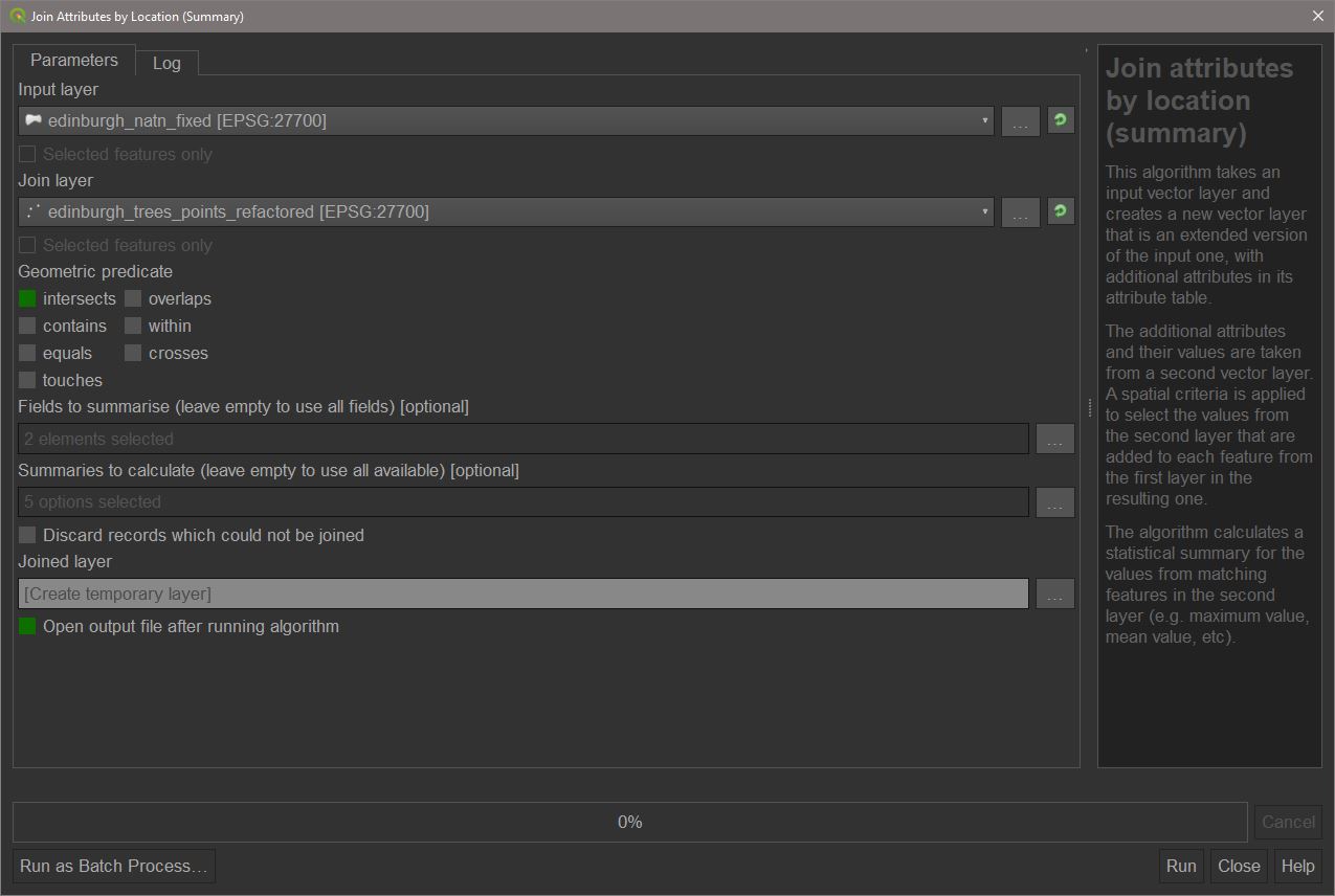
Use ‘natural_neighbourhoods_fixed’ as the input layer and ‘edinburgh_trees_clipped’. Click  the three dots to choose ‘Fields to summarise’ and check ‘TREE_HEIGHT_AV’ and ‘TREE_SPREAD_AV’. For ‘Summaries to calculate’, choose: count, min, max, range, and mean. Now press
 Run.
The output should be a polygon layer. Open the attribute table for this new layer. We can now see that new columns have been created which include the counts for the variables specified and some summary statistics for each. These are summaries for each natural neighbourhood feature. The count is the same for both HEIGHT and SPREAD and is the number of points (trees) which fell within that neighbourhood. Call this join layer ‘edinburgh_natn_trees_join’.
It is also possible to join without summarising. Search and open Join attributes by location in the processing toolbox. Use the same inputs as for the summary join. Select ‘one to many’. This will now join the attributes of the natural neighbourhoods layer to any intersecting points. Depending on which is the input, and which is the join, the result is either the creation of a single feature with the attributes of the first join feature added on, or duplicate geometries for each feature that is joined, for example, an intersection join for points to a polygon without summarising will yield one new polygon for every intersecting point with that point’s table joined to the new polygon. Generally, the way to remember this is that if the input layer has fewer features than the join layer then we will produce as many features as are in the join layer and vice versa.
Centroids
It is often useful to represent data contained in polygons as individual points which can be joined with other layers or turned into proportional symbol maps. The Centroid tool can be used to produce a point which lies at the geometric centre of a polygon. Open the tool from the processing toolbox under Vector geometry or from Vector > Geometry > Centroids. Choose the ‘edinburgh_natn_trees_join’ layer which we previously created using the summary join as the input and run it.

Name the output layer ‘edinburgh_natn_trees_centroids’
There is a problem with this method, however. Not all polygons will have simple, convex geometries. Some may be more complex shapes where the geometric centroid is outside of the polygon boundaries. The image below shows an area where some polygons appear to have multiple centroids.

Really, there are neighbouring polygons where the centroids do not fall within the geometry. These centroids are therefore not spatially representative of where the natural neighbourhoods actually are. To get around this we can use a different tool to generate centroids: Point on surface. This will produce a centroid which strictly falls on the surface of the parent polygon.

Running this again for natural neighbourhoods we can see that all polygons have a single point each. The map below demonstrates the difference between the point on surface and centroid methods.

We will use the point on surface method, so name the output for this ‘edinburgh_natn_trees_points’, and remove the centroids layer.
Some spatial datasets have existing centroids available with statistical weighting applied. England and Wales statistical Output Areas have their population-weighted centroids available. If a population-weighted centroid dataset exists, this would be the preferred choice over generating them by hand as they are the best for use in official statistics.
Editing and Saving Data
Now that we have worked with some data using basic geospatial tools, we can do some deeper editing and look at more ways of storing geospatial data.
Attribute Tables
Spatial data, just like non-spatial data, is built around tables with data. Individual features (for example, a point, a line segment, or a polygon) are defined by individual rows, and their attributes can be contained in multiple columns, which are also known as Fields. This is the same as any non-spatial table for example, a spreadsheet with the names and addresses of individuals. The difference with spatial data is that there is also a field which holds geometry information which can be read by software or code.
As in a spreadsheet, fields also have a type. The data types possible include integers and floats of varying precision, strings (text), date formats etc. As with non-spatial data, we have to make sure the columns are the right type when creating, editing, or using them for analysis.
Create Fields
To edit existing fields or add new fields directly to an attribute table, we must be in ‘edit mode’ for the currently selected layer. To do this, click on the ‘trees’ layer, then from the Vector Toolbar select Toggle Editing. We are now in edit mode. Open the attribute table for the trees layer. In the top bar, find the New Field button. This will open a dialog box.
Now, we can specify the name of the field and the type of values it can hold. Always try to make sure new fields are named consistently with existing fields. Common naming patterns are CamelType, Snake_Type, and SCREAMING_SNAKE_TYPE. The field type drop down works the same as when refactoring fields.
Field Calculator
The field calculator uses SQL-like expressions to perform a range of possible operations on a field. As this is a basics tutorial, we will just use standard numerical operations.
This calculator can be used to calculate a number of useful outputs for analysis. There are also default operations which can come in handy. Entering $area, for example, will return the area of the features (individually). We’re going to use this to calculate the density of trees in each natural neighbourhood. With the summary-joined natural neighbourhoods selected, open the field calculator and copy the entries from the screenshot below.

As $area calculates the area of a feature in map units, we may want to convert them to a more common one. As the project map unit is metres, we will multiple by 1,000,000 to convert to square kilometres. Press OK to finish.
This operation will not create a new layer. If we open the layer’s attribute table we can see that a new field has been created containing the result of the calculation.
Data Formats
Spatial data comes in specialised formats designed to hold geometry information. The three most common methods of formatting spatial data are Shapefiles, GeoDatabases, and Geopackages.
Spatial data can, however, also be formatted in standard data formats such as .csv or .txt. These can also retain the geometry column, making them easy to convert back into features, but can also be opened and edited in programs like Notepad and Excel.
Exporting data
QGIS contains a single UI for exporting data.
On the ‘edinburgh_trees_clipped’ layer, right-click and then choose Export > Save feature as.... From here, we have a few options. The top drop-down is where we choose the output format. There is a large range of formats available depending on the desired output.
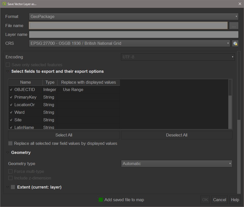
When saving to a geopackage (GPKG) or geodatabase (GDB), a layer name must also be specified. Multiple layers can be saved to the same geopackage or geodatabase. A shapefile only needs the file name.
We will export to a geopackage. Select the Geopackage option. Click the three dots and choose a suitable geopackage name e.g. ‘edinburgh_tasks’. Now, set the layer name to the same as we choose for this layer in QGIS i.e. ‘edinburgh_trees_clipped’. Press Ok to save the layer to the geopackage. Now repeat this process for some other layers, however, make sure to choose to save to the geopackage we just made by selecting it in File name rather than creating a new geopackage. Do this for: ‘edinburgh_natn_dissolved’, ‘edinburgh_natn_trees_join’, and ‘edinburgh_natn_trees_points’.
If we want to export the attribute table alone, we can choose the CSV option and export as previously without specifying a layer name.
Basic Mapping in QGIS
This section will cover some of the options available for producing basic map visualisations. Once this section is completed you will be able to create a number of maps depending on the types of underlying data and purpose of the visualisation.
Layer Styling
So far, QGIS has assigned random, default colours to imported and created layers. If we want to make the maps presentable, we’ll need to edit the style of the layers to highlight the data we are trying to get across.
To edit the layer styles, we will use the Layer Styling panel. If not already, enable this from the menu bar under View > Panels > Layer Styling.

Layer style can also be edited by right clicking on a layer, choosing Properties, and going to the Symbology tab. This can be useful if there is little room on the screen for additional panels, however it can make it harder to see the impact of a new style as you make changes as they will not apply until OK has been clicked.
Using the layer styling panel we can start to improve the appearance of our layers.
Symbology
Before we look at the different approaches for layer styling, here are some fundamental options which apply to each type.
In the style panel the four most important options are Fill Colour, Fill Style, Stroke Colour, and Stroke Style. Setting the style for fill or stroke to No pen will result in the fill or stroke not showing. This is a good way to only show borders on top of other layers.
When working with colours in maps it’s very important to be aware of both the aesthetic value of the colours and also how accessible they are. Colour schemes should be equally legible to colourblind and non-colourblind people. ColorBrewer is a useful website which displays palettes based on different criteria, including suitability for colour-blindness.
If we want to display some detail of layers below another but want both to be visible, we can change a layer’s transparency under Layer rendering in the Style panel. This is useful when we want to further contextualise one layer against another such as placing boundaries on a street map.
Single Symbol
This is the default style for all layers. With single symbol styling, all features in that layer will have the same appearance for example, all tree points will be the same size and colour. This can be useful when we want to provide, for example, a background layer to provide some spatial reference.
Graduated
Graduated maps use a scale starting from one data value and ending at another. A gradient palette is split up into a specified number of groups and split up across the data range. Graduated styles therefore use colour bins to display the data. For the natural neighbourhoods layer, select the drop down in the layer styling panel which says ‘single symbol’ and change this to ‘graduated’.
We may now specify the number of bins for the data, the palette used, and the method for creating the breaks. There are some best practice measures for choosing each of these.
When choosing the number of bins, we must consider both the palette and the values. Monotone or duotone palettes may be difficult to interpret if many classes are used as the difference from one shade to the next may not be very visible e.g. Reds, BlPu. A palette with three or more colours, like Viridis, can potentially show more classes before differences become hard to see. Generally, it’s a good idea to use around 5 or 6 classes, but this may need to be increased or decreased slightly depending on the variation in the data.
The breaks methods can help us deal with different distributions in the underlying data and therefore produce more accurate maps. The Mode dropdown shows the breaks available in QGIS. As with any other visualisation, the optimal mode will depend on how the data is distributed. Generally only two methods will be needed; data spaced evenly across a range will work best with quantiles, but data which has clusters or outliers will be best shown using Natural Breaks (Jenks).
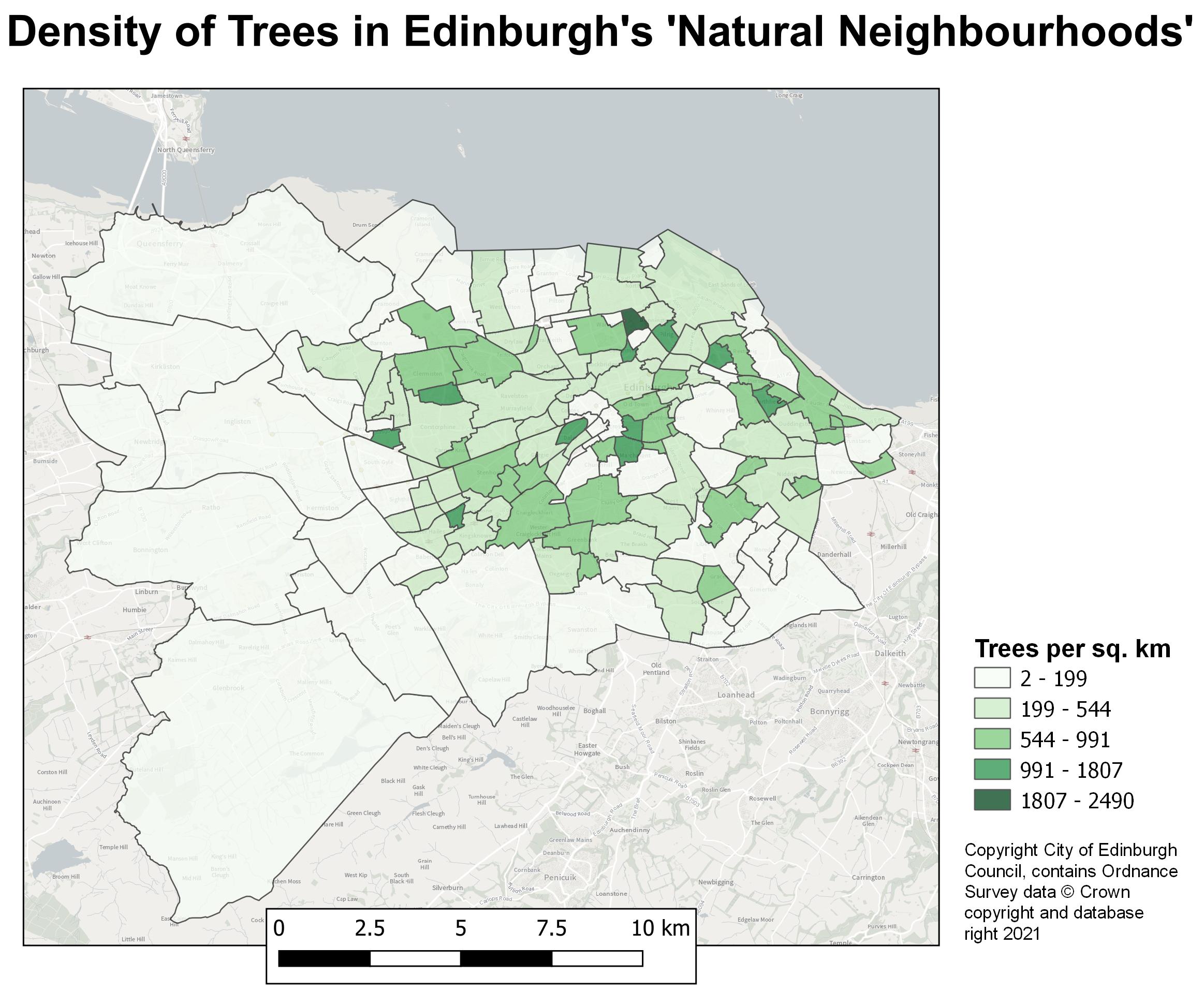
When applied to a polygon, a graduated map is called a ‘Choropleth’. To show what this looks like for the natural neighbourhoods layer, we will set the value for a graduated map to ‘TREE_HEIGHT_AV_COUNT’. Change the mode to Natural Breaks (Jenks) and press Classify. By default this will create 5 bins. Try out different colour ramps and see which look good with the selected data while also being colour-blind friendly. You could also try adjusting the number of classes to see how this changes the map, and also what different break types do.
There is a problem with this type of choropleth. We’re visualising the count of trees in a given area. This can be deceptive as larger areas, as a general rule, will have a higher count of trees simply because they can contain more. To counteract this the data for a choropleth should always be normalised. This is usually done in two ways: creating a summary statistic, or normalising by area or per X count of a value for example, trees/km^2 or trees per 1,000 population. We have already created summary statistics and calculated the density of trees per km^2. Try changing the values between ‘TREES_HEIGH_AV_MEAN” and “TREES_DENSITY_KM2” to see how this changes the appearance of the layer. The latter should result in the larger areas now being grouped into the lower values, while we can see that tree densities are actually much higher in the smaller, more central neighbourhoods.
Categorised
Categorised maps are similar to graduated maps except the bins are based on unique values rather than a continuous range. Categorical maps can be messy if too many unique values are present, so it’s usually a good idea to keep the number of categories to the minimum possible.
Basemaps
A basemap is a dynamic map layer which provides a background map which can contextualise our other layers. For example, a background map might be a street map or a topographic map. These maps are rendered depending on the current zoom scale and often cover entire countries, continents, or the whole world depending on the project CRS.
As an ONS employee you will have access to basemaps from the Ordnance Survey Data Hub as part of the Public Sector Geospatial Agreement (PSGA). To gain access to these basemaps you simply need to sign up with a Public Sector Account at the data hub. Your application will have to be processed by an administrator to verify your employment but this shouldn’t take long. Before verification, however, you will still have access to open data APIs for use as basemaps.
Once signed up and logged in to the Data Hub, go to API Dashboard > APIs. Now by ‘OS Maps API’, click Add to API project and Add to NEW PROJECT and call the project ‘QGIS’. Now, if not automatically redirected there, in My Projects > QGIS copy the ‘WMTS API Endpoint address’.
In QGIS in the Browser panel, right click WMS/WMTS and select New connection.... This will open a new window. Choose an appropriate name for this basemap for example, ‘OS Raster’. Paste the copied link into the URL bar and then click OK. Under ‘WMS/WMTS’ will now be a new item with the name you chose. Expand this item and drag one of the subitems into the layers panel. QGIS will now render this basemap as a layer, and it can be reordered and toggled on/off as any other layer. As this is a BASE map, it should be placed under all of the other layers.
Print Layouts
Layer styling is the first step in producing map visualisations. To expand on the amount of information a map can present in a single image we must create a ‘print layout’. To make a new print layout, go to Project > New Print Layout or use ctrl+p. Choose a suitable name for the layout e.g. ‘Edinburgh Tree Map’.
Layout UI
The print layout will open in a new window with a different set of toolbars and panels to the main QGIS window.

The right panels show the active ‘items’ in the layout, and properties/options for the currently selected item. In the layout items are map views, text, legends etc. On the left is the Toolbox toolbar. The main tools we will use from this toolbar are:
| Icon | Description |
|---|---|
 |
Pan and zoom. These apply to the layout view itself not map views |
 |
Select/move items. Selecting an item will make it the active item in the properties panel. |
 |
Move item content. This will move the internal content of the selected map view item in the same way as panning and scrolling works in project view.> |
 |
Add map view. A map view is a essentially a link to the main project window and will render active layers from there. The map can be panned and zoomed in on while `Move Item Content ` is enabled. |
 |
Adds a text box to the layout. The text can be moved with `Select/Move Items` and formatted in the item properties panel. |
 |
Adds a legend. The legend is linked to the layers available in the project. Items in the legend can be customised in the item properties panel, including what items are included, their order, and formatting. |
 |
The first tool adds a scalebar to the layout. This is linked to the zoom scale of a selected map view. Scale bars are primarily useful when aiming to show the distance between data or in contexts where the scale of the map is otherwise unintuitive. The second tool adds a north arrow/compass rose. This is rarely needed, usually only for specific scales or boundaries where the top of the map is not North, the target audience of the visualisation may be unaware of the geography's orientation, or where the map describes some phenomenon related to compass bearing. |
Adding maps
To add a map to the layout we use the Add map view tool from the previous table. With this tool selected, click and drag in the white area to draw the boundary of the view. This view will now display the same map that we can see in the project view. In fact, this map view and the project are linked such that changing layer styles and active layers in the project will change the view in layout.

This map can be moved using the move item tool. In addition, the `Move item content` and  Layout map view zoom buttons can be used to pan and zoom within the map view item. Resize the map view item and pan and zoom until the whole layer is visible and fills a good portion of the layout.
Customising Maps
Legends & Extras
A legend is a necessary part of a map as it allows the viewer to understand what colours and symbols mean and how they relate to the underlying data. With the legend tool selected, click and drag anywhere in the layout to create a new one.
By default, the legend will contain entries for every layer active in the project. However, as we are only displaying a single layer, we only want a single entry. To change what is displayed in the legend go to the Item Properties panel while the legend layer is active. Here we can see a list of all legend items. To customise this list, disable Auto update. Now, select all the layers displayed and press 
Now we can add the correct layer by pressing  and choosing the layer used to create the choropleth. Now the legend will display the correct information for the layer visible in the layout view.
We can further customise the legend under the Fonts and Text Formatting section. Click each font option to customise the appearance of the text and see which sections relate to which parts of the legend. Ideally the title for each layer will stand out from the corresponding symbol labels.
Along with the legend it might be useful to add a scale bar as the data shown relates to a measurement of distance. Add a scale bar using the associated tool from the table above. Customising this toolbar can be tricky at first but with practise becomes simple.
Firstly, we can edit the style of the scale bar under main properties. Try changing Single box to other options and see what it does. Some of these styles may not be as easily readable, so for now we’ll stick to the original.
To change the number of divisions of the bar and the distance shown the Segments section of the item properties can be altered where it says ‘left 0’ and ‘right 2’. Change ‘right 2’ to ‘right 4’ for example and the bar will increase to 4 segments. The length will also change. This is because the width of each segment is fixed to a certain number of map length units i.e. each segment will be 2.5km, so having 4 segments will yield a scale bar ranging from 0-10km with divisions every 2.5km. Try experimenting with these variables to find a scale bar which sensibly depicts the scale of the map. Normally, around 4 divisions of about 1-4 units width each should be ok.
Text
While ‘a picture says a thousand words’, the context of a map is usually impossible to discern without some text to describe it. Using the label tool we’ll add a descriptive title to the map. With the tool selected, click and drag to create a text box. This will contain a ‘Lorem ipsum’ placeholder by default.
The properties of the text can be customised in the Item Properties panel. Try experimenting with some of the options under Appearance. When multiple labels are present, they should follow a natural order of precedence: Titles should be the largest and boldest, headers smaller and less bold, descriptive text should be of a normal but readable size, and layer labels and data credits should be visible but unintrusive.
Add a title to the map using the text tool. It should be descriptive enough that it alone could get across the content and purpose of the map, but short enough that it can be read at a glance.
It is also important to add credits for any data used in the creation of the map or figures. Our map has used data from the City of Edinburgh, so we need to use their acknowledgements in credits. We also used OS basemaps and so need to follow their acknowledgement guide. For our purposes this can be done with the following acknowledgement:
Copyright City of Edinburgh Council, contains Ordnance Survey data © Crown copyright and database right 2021
We’ll render all text in the Arial font. This is a very legible font above size 10 and is the standard font used across government.
Exporting Maps
Now our map is finished we can export it to use elsewhere. Bear in mind that the purpose of this map is to quickly visualise some geographic data for informal use only for example, a presentation to a team or on a github page.
Multiple formats are available when exporting a map. Open the Layout drop down from the menu bar, and navigate down to the three options: Export as Image, Export as SVG, and Export as PDF. Image will allow us to save to a standard image format like a .jpg or .png. And SVG is an image format which maintains the contents of the image as vectors rather than pixels. An SVG can be opened and edited in a non-raster editing suite such as Adobe Illustrator. Unfortunately, attempting to do this will give a warning that QGIS’ SVG library is not adequate for saving to this format and advises to export as PDF instead. Exporting to PDF will save the map as high quality PDF.
As we want to use this visualisation elsewhere, such as in presentations or as here in a github markdown document, we will export as an image. After choosing a file name and format (png and jpg are preferred), a dialogue will let us choose the resolution of the output.
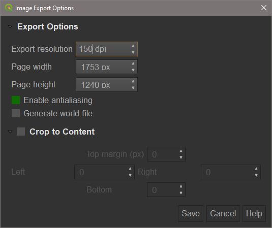
Although standard print resolution is 300dpi, for our purposes 150-250dpi will suffice. Any greater can produce very large files which can be awkward to transfer over networks and may clog up storage.
You have now completed the Introduction to QGIS course and should now be able to perform basic analysis work in QGIS. Well done!