How To Make A Good Map
Disclaimer: Work in Progress!
This course is currently in development. Please note that content may change and some parts are currently incomplete. However, we hope you find this resource useful, even in its current state.
Course Summary
Introduction
This course introduces users to the best practice around mapping for a statistical context. We’ll introduce the most common types of maps used to present statistics, and will provide guidance on what to think about when making a statistical map to ensure you make a clean, accurate and informative map.
Estimated time for course
1 hour
Audience
People with a basic understanding of geography who wish to make statistical maps.
Course Aims
This course covers:
- The most common types of statistical maps
- Fundamental map components:
- choosing a suitable map type for your data
- choosing a suitable type of statistical boundary for your map
- choosing suitable bins/groups
- choosing a good colour scheme and/or symbology for your map
- Additional map elements including:
- base mapping
- legends
- labels
- text
- scales
- Exercise: map critique (with discussion answers)
Introduction
One of the best things you can do with geographic data is visualise it by making a map. Like any other visualisation, a map can display data to help an audience understand the data better and can also be helpful for storytelling.
Throughout this course we will guide you through the best practice of making a statistical map and some common pitfalls to avoid. By the end you’ll be confident identifying the most common statistical map types, know about the main elements of a map and know how to put them together to make a well designed output.
Map Types
There are many different types of map which can be used in a statistical context. The type of map you use will depend on the properties of your data and the purpose of the visualisation. As we’ll explain soon, some types of map are only suitable for certain data types, and some styles of map are better at showing certain data features than others. However, where there are multiple suitable map types it up to you, the map maker, to pick a style which best illustrates the data without misleading.
In this section we will introduce some of the most common statistical map types and outline the best contexts for their use as well as the common pitfalls to avoid. By the end of the section you should be able to think about your data and pick a suitable map type.
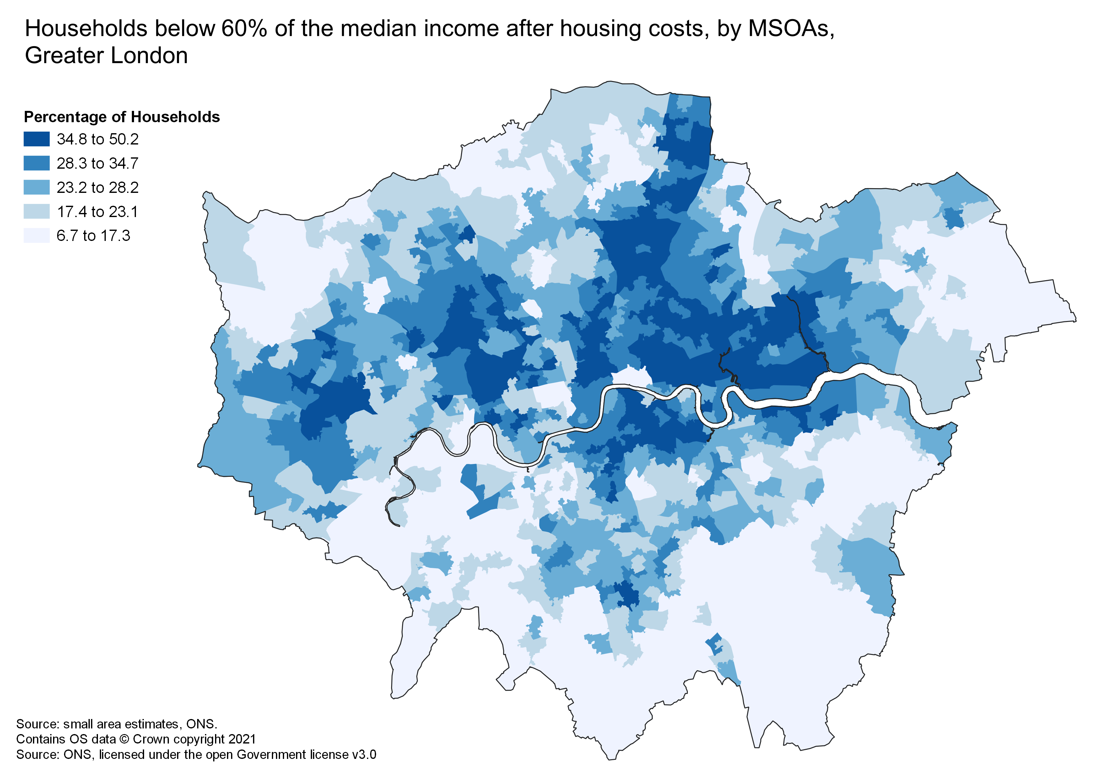
Choropleths
Choropleth maps are frequently used to display statistical data by colouring defined geographic areas to represent the statistical values for those areas. These maps are good at illustrating spatial distributions and patterns in an easily understandable and intuitive way. These maps are the most commonly used statistical map so it’s likely your audience will be familiar with them.
Choropleths can display data when it’s:
- standardised as a rate or ratio (but never as raw counts)
- a continuous dataset
- attached to a standard set of areas, for example, a statistical geography provided by ONS.
The main pitfall you can make with choropleth maps is plotting raw counts on your map. Plotting counts on a choropleth is misleading as it fails to account for the different sizes of the geographic areas you are plotting, which makes comparisons between the areas unfair. By plotting standardised data you overcome this problem. You can standardise data in a number of ways, for example, instances per km^2, instances per 10000 of population, or as a percentage. If plotting raw counts is important for your visualisation you should consider using a different type of map, such as a graduated or proportional symbol map.
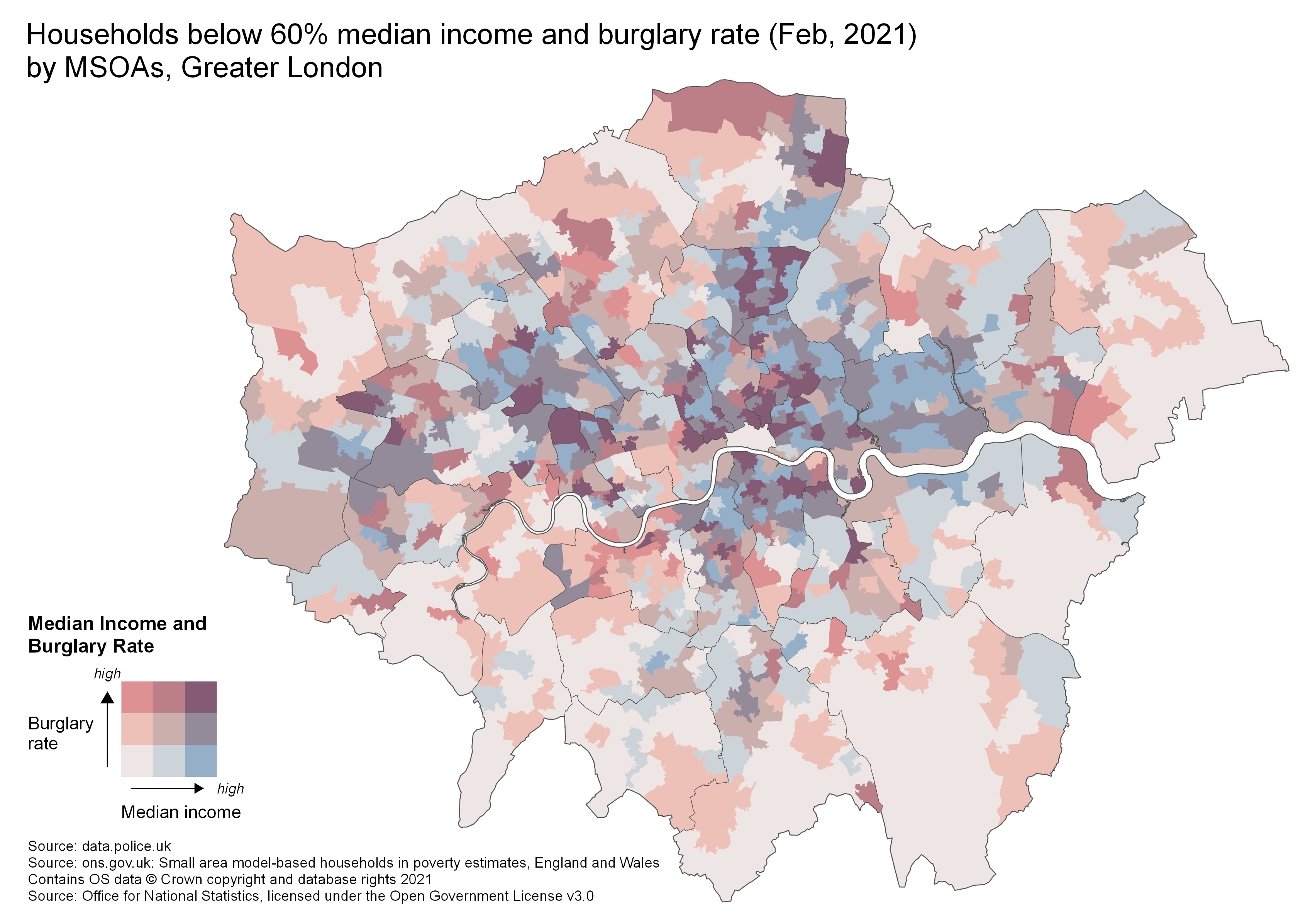
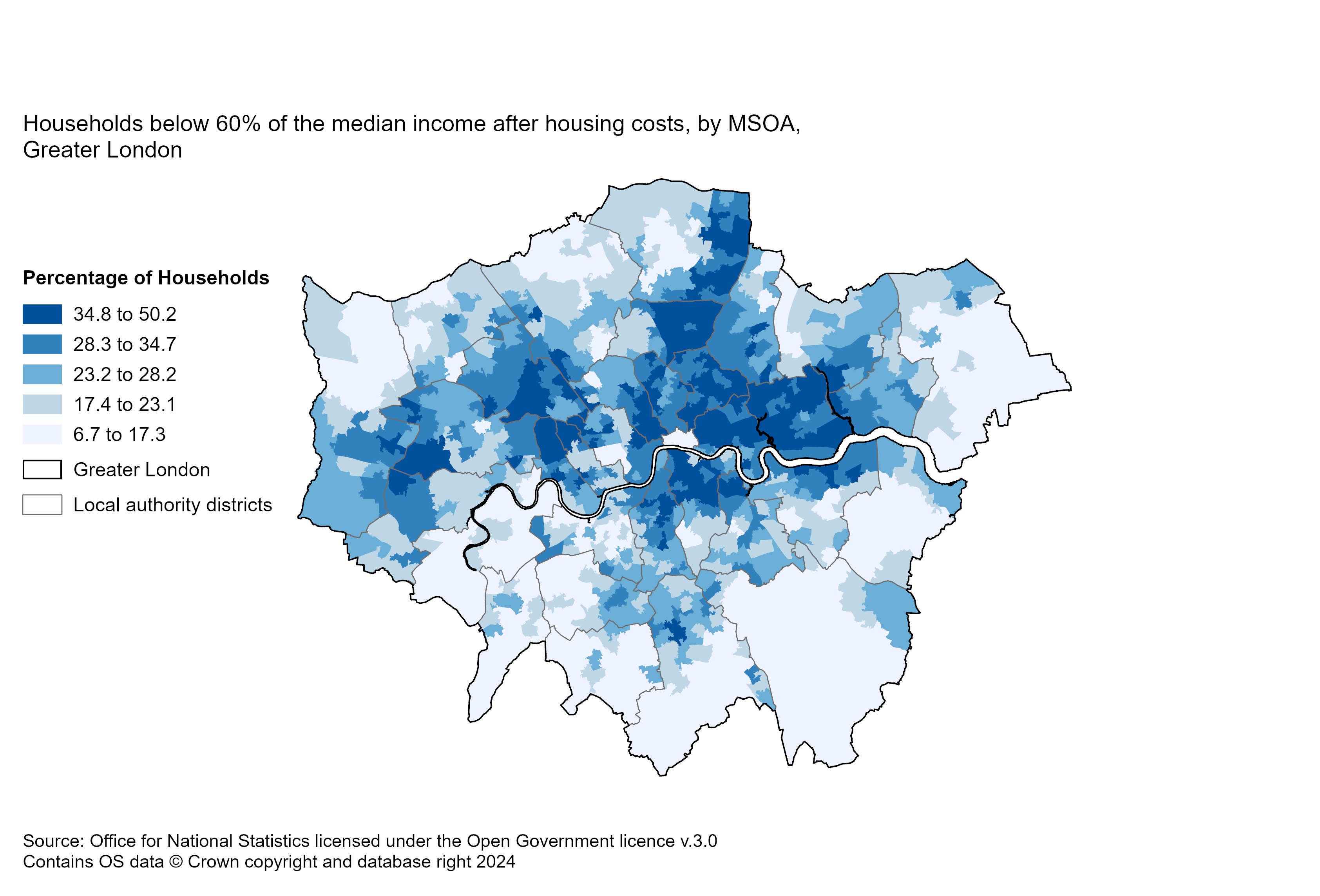
The image below is an example of a choropleth, which shows of the percentage of households below 60% of median income, after housing costs, in London Middle layer Super Output Areas (MSOAs).
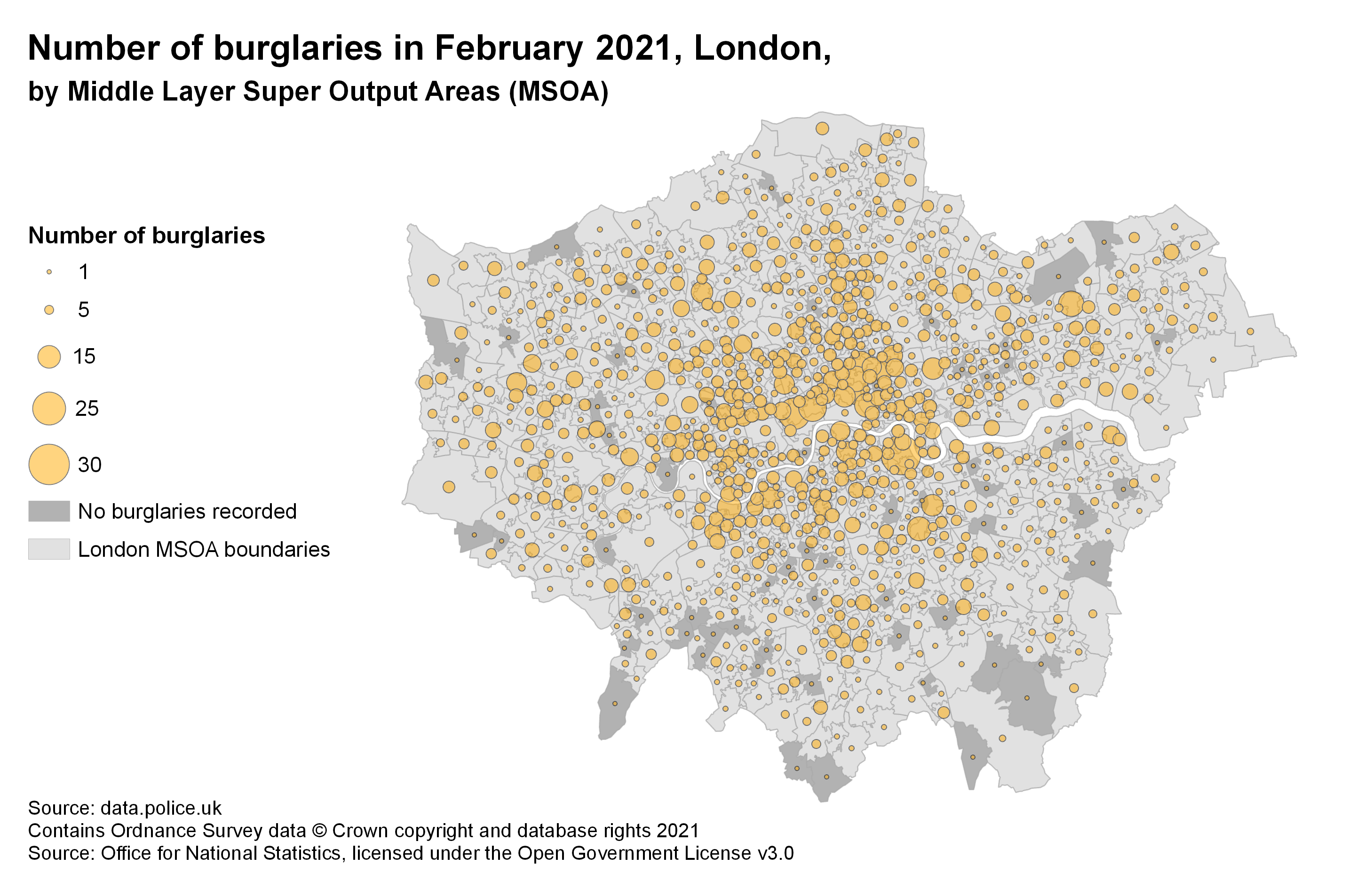
Graduated and Proportional Symbols
Graduated and Proportional Symbol maps are a good alternative to choropleths for visualising quantities or raw counts. These maps represent the data through a series of differently sized circles, which vary in sized based on the underlying data. While graduated and proportional symbol maps look very similar, the method used for calculating the circle size differs between the two map styles.
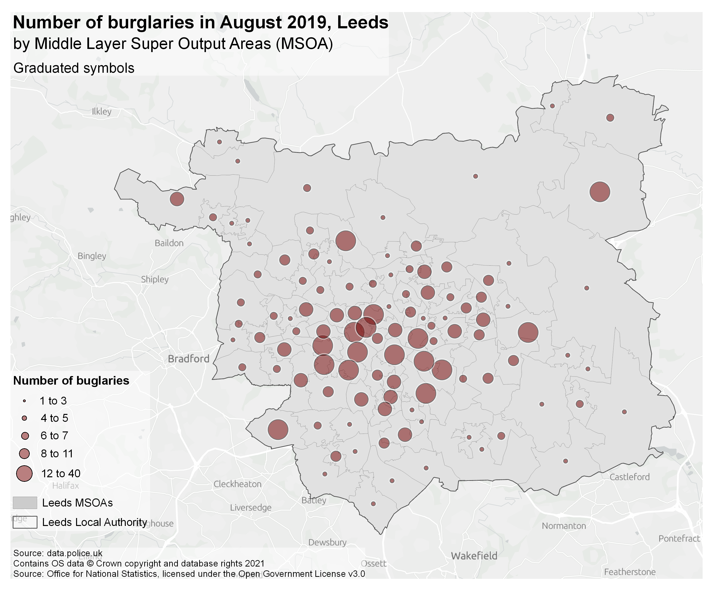
Graduated symbol maps divide the underlying data into classes, just like a choropleth does; each class is assigned to a circular symbol of a specific size which represents the class. Graduated symbol maps provide a clear indication of which sized circle relates to which data value, and so can be easier to interpret than proportional symbol maps. Below is an example of a graduated symbol map.
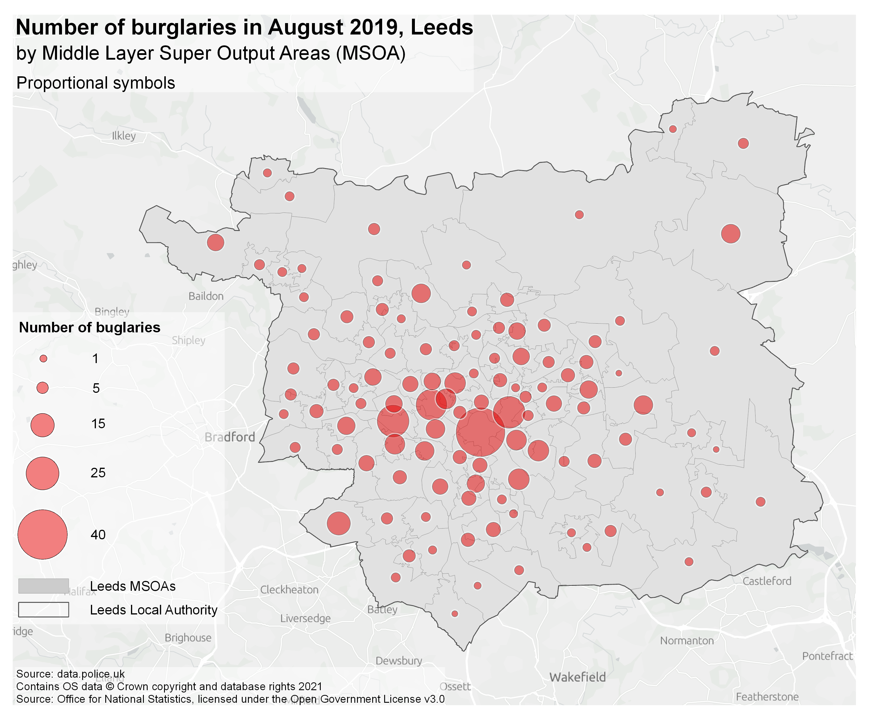
Proportional symbol maps do not categorise the underlying data into classes. Instead, each data value is represented by a circle which has an area proportional to its corresponding data value. Because of this, proportional symbol maps can have a wide range of different circle symbols which can be hard for the user to interpret properly. Also, if your dataset has extreme values they will tend to have very large circles which can take over the map easily. The map below is an example of a proportional symbol map - it uses the same data as the graduated symbol map above, so you can compare the two styles.
With both of these maps types you should consider the overall scale of the map and the density of points: if the symbols are very dense they can overlap and become unreadable, or they can cover up underlying geographies and thus hide their spatial context. Sometimes you can overcome this by using design features like making your circular symbols slightly transparent or, if this is not appropriate, by selecting a different style of map.
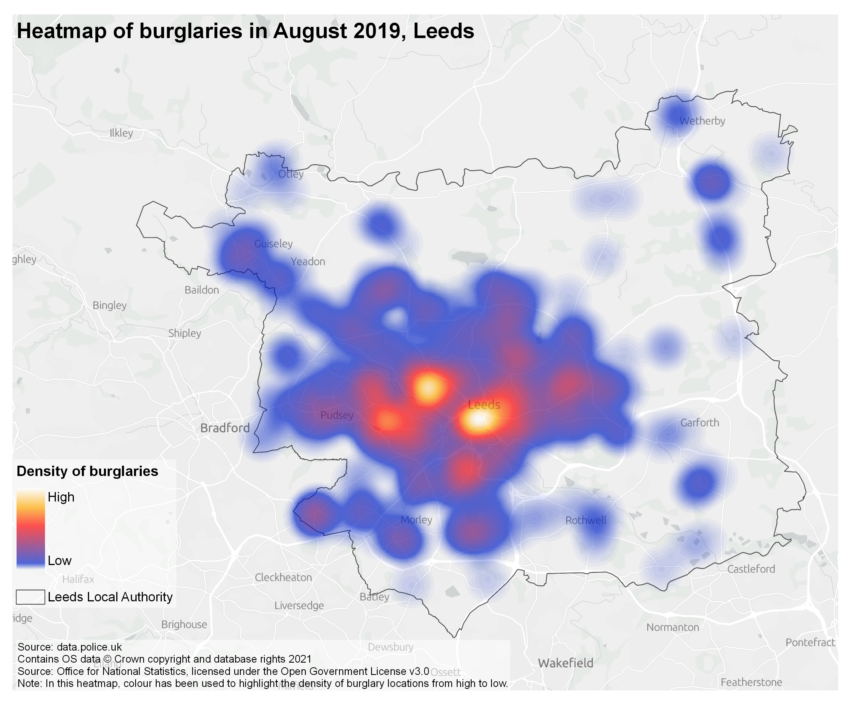
Heatmaps
A heatmap is created by using point data to make an interpolated surface which represents the density of data points across a geographic area; this surface can also be weighted by an attribute of the underlying data. The surface is coloured with a continuous colour ramp. Heatmaps make it easy to understand the overall trends in point data, including by highlighting areas of particularly high or low density. However, through the creation of an interpolated surface, error can be introduced into your analysis. So, this is a better style of map to visualise data for overall trends, rather than for accurate numerical analysis.
The map below is an example of a heatmap for burglaries in London which has been weighted by financial loss per burglary. Across the map you can see areas with higher density, shown in a darker colour. These represent areas where there have been a high number of burglaries or where there has been a high financial loss.
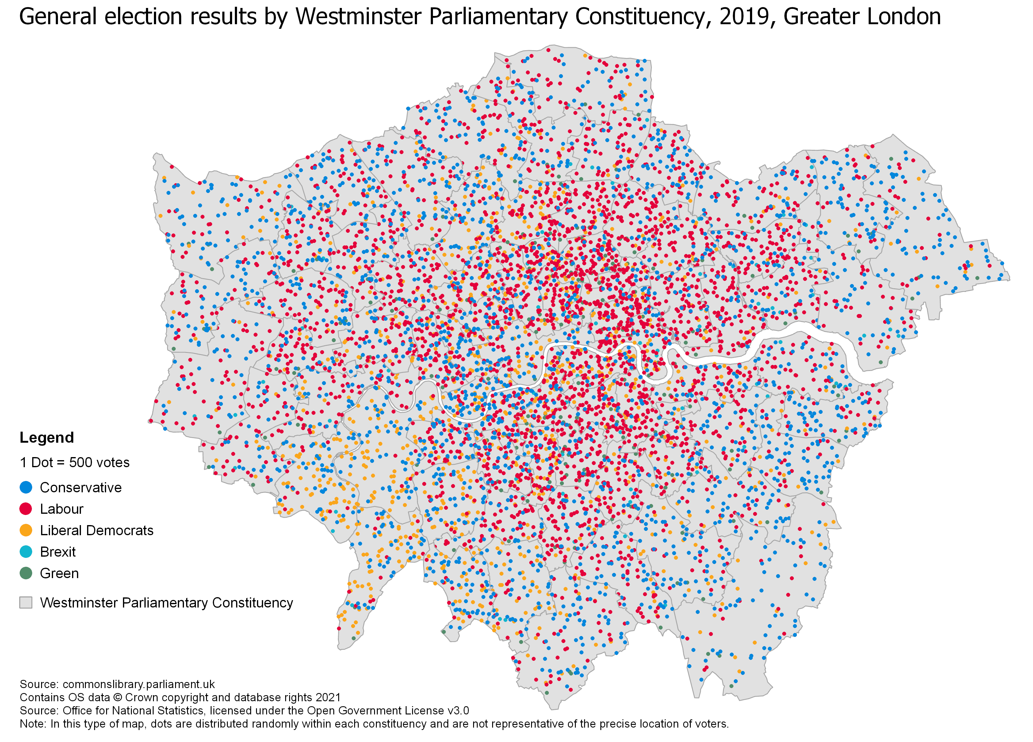
Dot Density
Dot density maps use dot symbols to represent observations. Each dot is of identical size and represents the same number of observations as each other dot on the same map - either one-to-one (where one dot is one observation) or one-to-many (where one dot represents a number of observations, eg, one dot equals 500 people). The position of the dots can be assigned either randomly within an associated polygon (eg. an Output Area) or in the actual location of the observation. A colour palette can also be used for categorical data to represent the distribution of the different categories. For example, the map below uses colour to show votes cast for different parties in the 2019 UK General Election, across London, where one point represents 500 votes.
Dot density maps are good for highlighting patterns and distributions in data. They can be used well in place of proportional or graduated symbol maps, and also when you’re tempted to break the rules and plot a choropleth with raw counts! When plotting dot density maps you should take care to ensure that the one-to-many value you use is appropriate for the data so it illustrates spatial distributions and data distributions within categorical data without being misleading. The one big disadvantage of dot density maps is they are incredibly frustrating to extract values from, so, if you need people to read values from your map, consider using labels or a different map style altogether.
Bivariate Maps
Bivariate maps are a type of choropleth which allow two variables to be plotted. Bivariate maps are best placed to show two variables which are related (either through a positive or negative correlation) but unlike your standard choropleth, bivariate maps tend to show broad classes and trends rather than more specific values. If you look at the map below you’ll see the legend is laid out like a plot with an x and y axis - each axis represents one variable and data is classified and coloured by which class it falls in on this plot. As bivariate maps show broad correlations it’s best to keep you number of classes to either 4 (2x2), 9 (3x3) or 16 (4x4) which is why bivariate maps are better at showing correlations and broad trends rather than more exact values - any more classes and it becomes too difficult to differentiate between them. As with a standard choropleth map, values on a bivariate map should be standardised rather than raw counts.
Bivariate colour schemes are difficult to get right; making sure they are accessible and easily distinguishable is tricky. Tools like ColourBrewer have colour palettes and we recommend you use them rather than making your own.
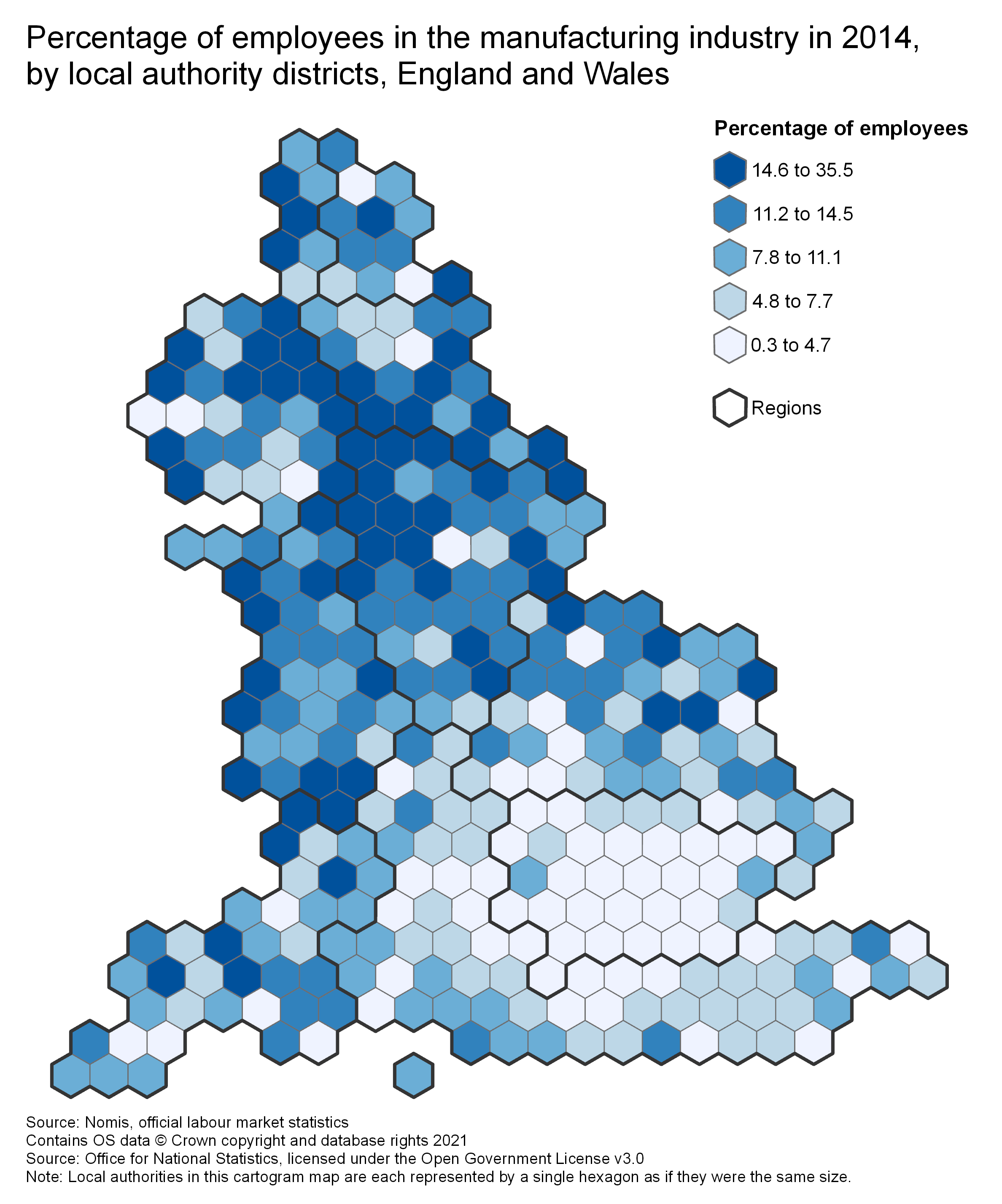
Cartograms
Cartograms are a type of map where the size and shape of the areas on the map are distorted from the real, physical reality. There are a number of different cartograms styles available so don’t be too confused by this! In a statistical context you will often see areas (for example, Local Authorities) represented as a series of coloured hexagons, we call these maps hexmaps and they are one style of cartogram commonly used when the real size and location of areas doesn’t matter too much or where the actual areas wouldn’t be recognisable by those looking at the map. In hexmaps the hexagons are laid out in a way which roughly represents the geographic location of the hexagons, this makes it easy for the viewer to understand the general trends in the data. Colour scales can be chosen to be appropriate for categorical data (more on this below) or for continuous data where values are binned like on a choropleth.
Mapping Categorical Data
The maps outlined above deal with continuous data which is most common in a statistical context. However, you may sometimes come across categorical data which requires mapping. When mapping categorical data it is best to choose colours for each category which represent that category best. For example, when mapping land cover it’s common to use green for rural areas and greys for urban areas because they most closely match the colours of those land uses in real life. Alternatively, some colours have a commonly recognised symbology in society, such as red for Labour and blue for Conservatives, which should be used to avoid confusion. When picking colour schemes for categorical data it is important to ensure each category has enough contrast when mapped against another, to make sure that the colour scheme is complementary and aesthetically pleasing, and to ensure no one category visually jumps out more than another by accident.
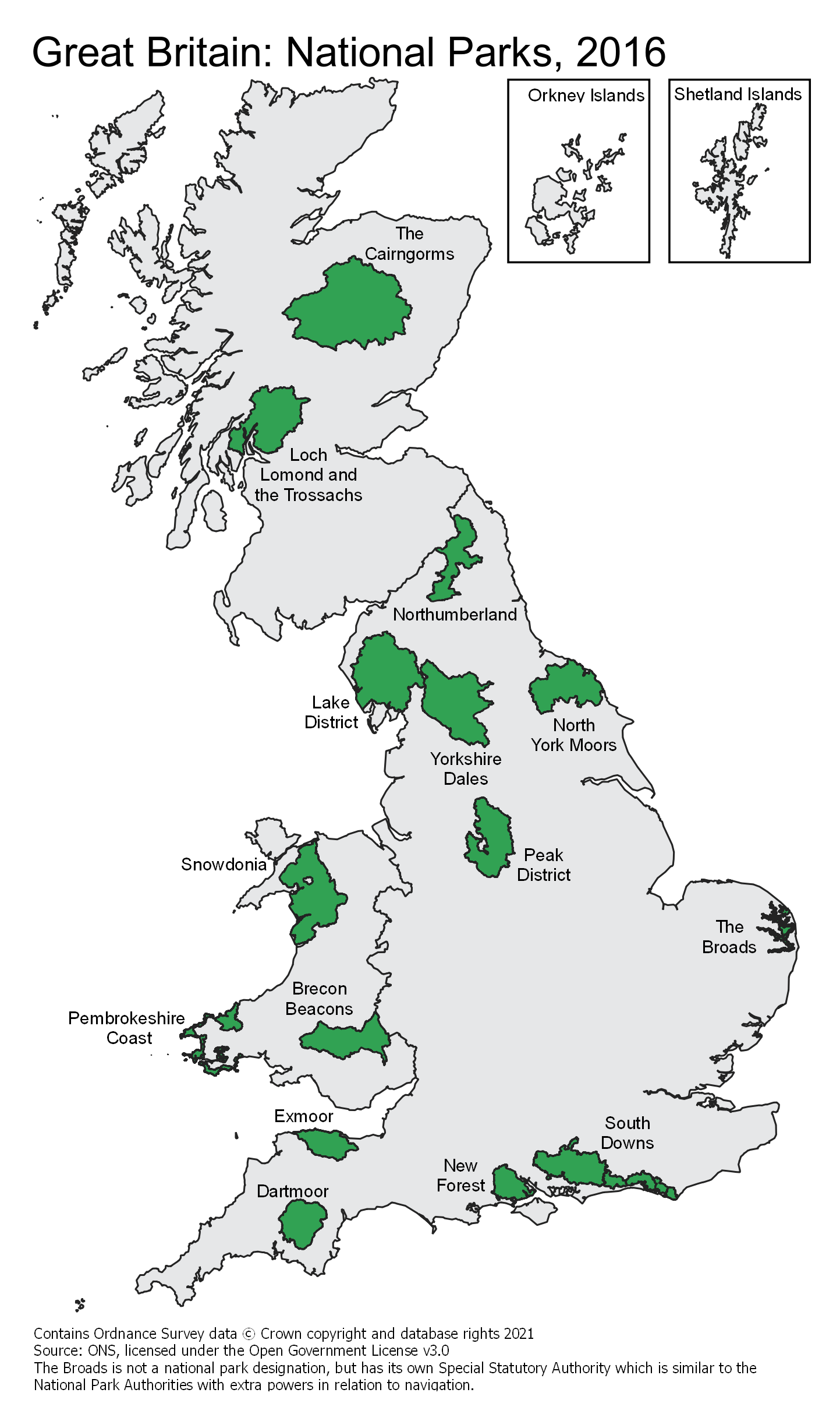
General Reference Maps
General reference maps are not a type of thematic map but they can augment reports and aid the readers’ understanding.
General reference mainly emphasise the locations of points of interest (POI) e.g:
- A postcode
- A route
- A city
- An airport
General reference maps are easy to read for most users as they are descriptive and visualise physical locations. The map below shows the locations of National Parks in Great Britain. Relevant features are labelled, and additional information is provided to enhance understanding of both the map itself and the National Park system.
Map Design
Now that you’ve seen a variety of map types which can be used to visualise your data, we will look at the specific choices to be made when designing your own maps. This section will cover boundary types, colour choices, feature symbology, additional map elements, map layouts, and what to consider in order to tell a story with a map.
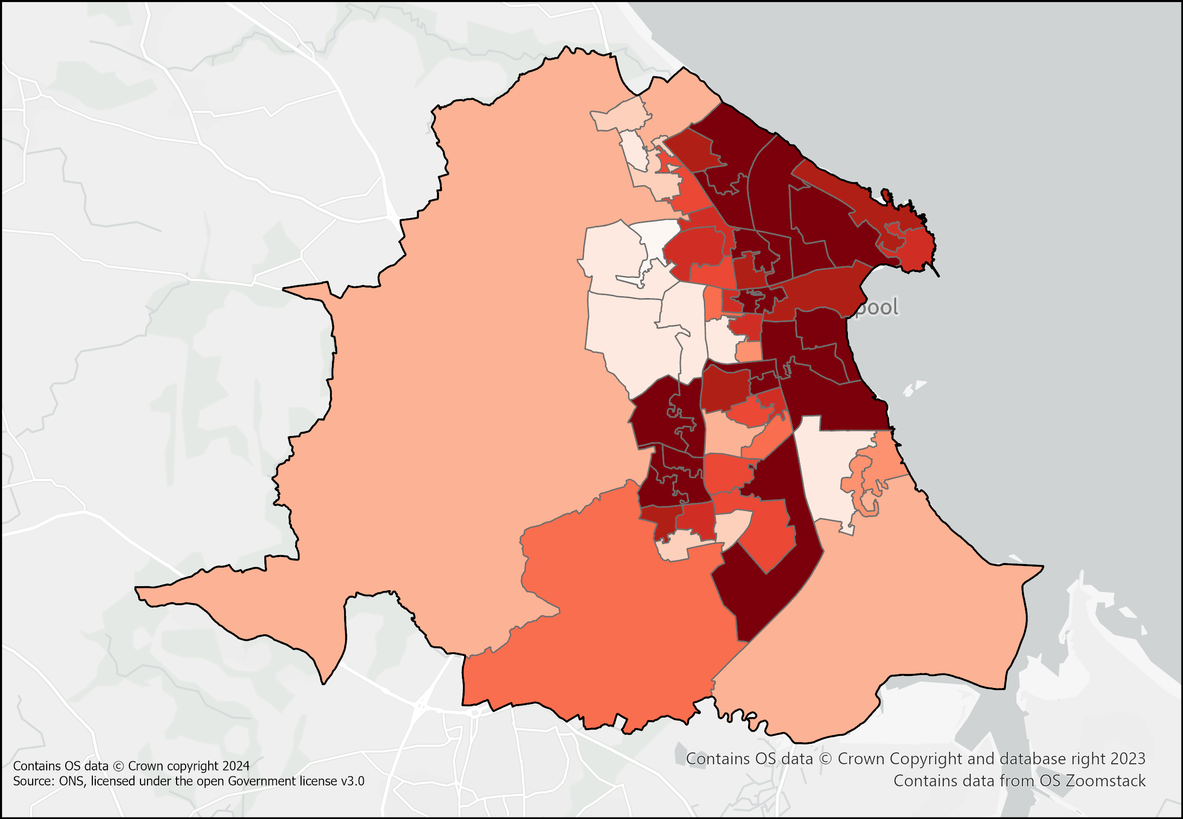
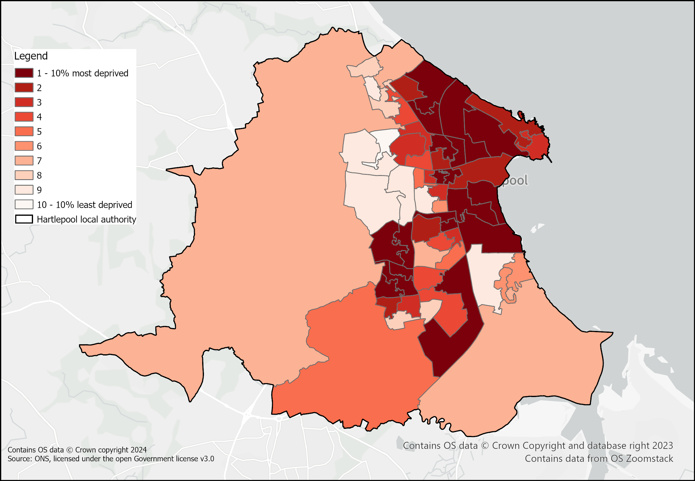
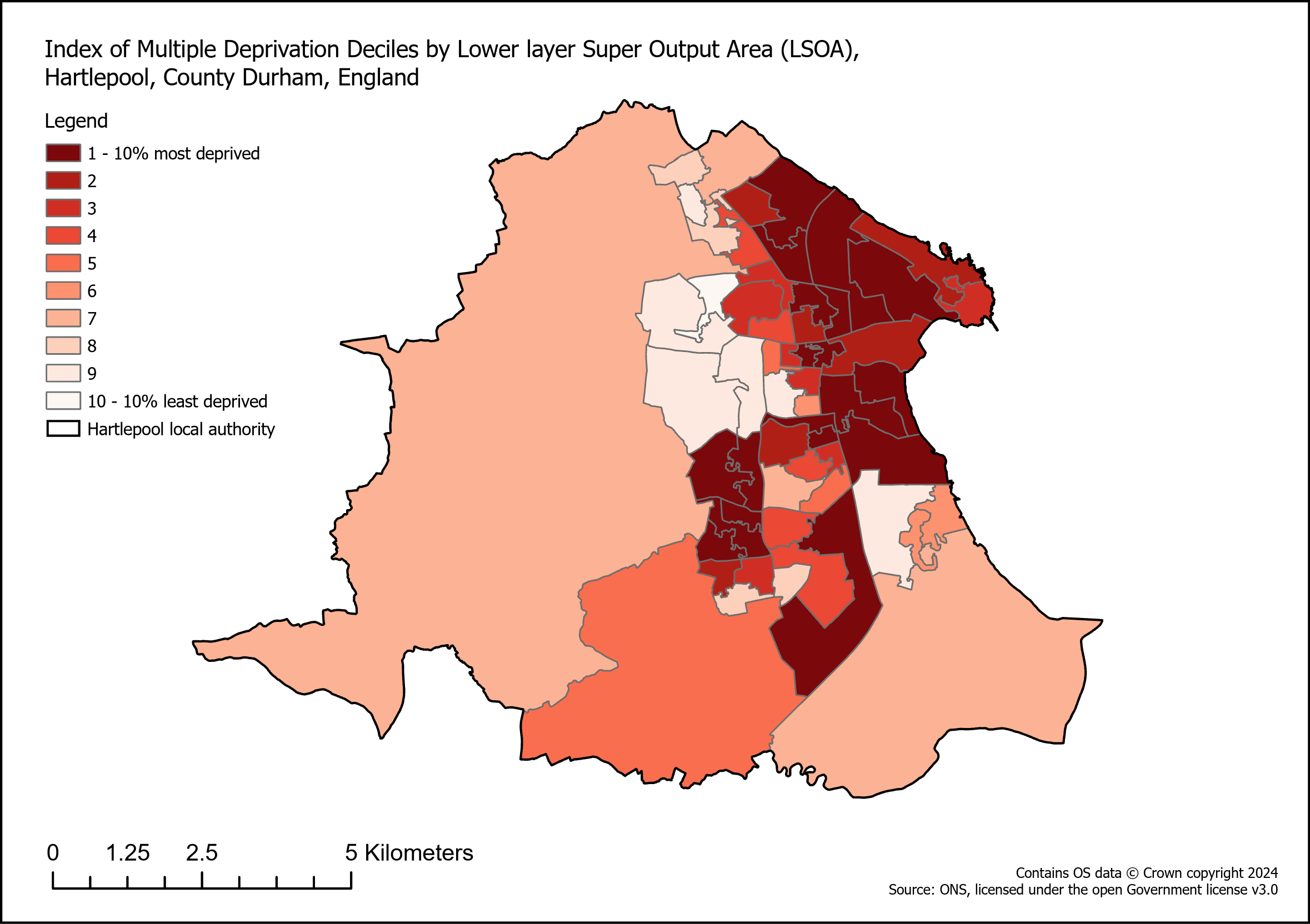
Boundaries
Boundaries refers to the area on which data is displayed e.g. an OA, LAD, County etc. These boundaries often come in different resolutions. The choice of boundary is important for both accuracy of the visualisation and for making it look good at the desired map scale.
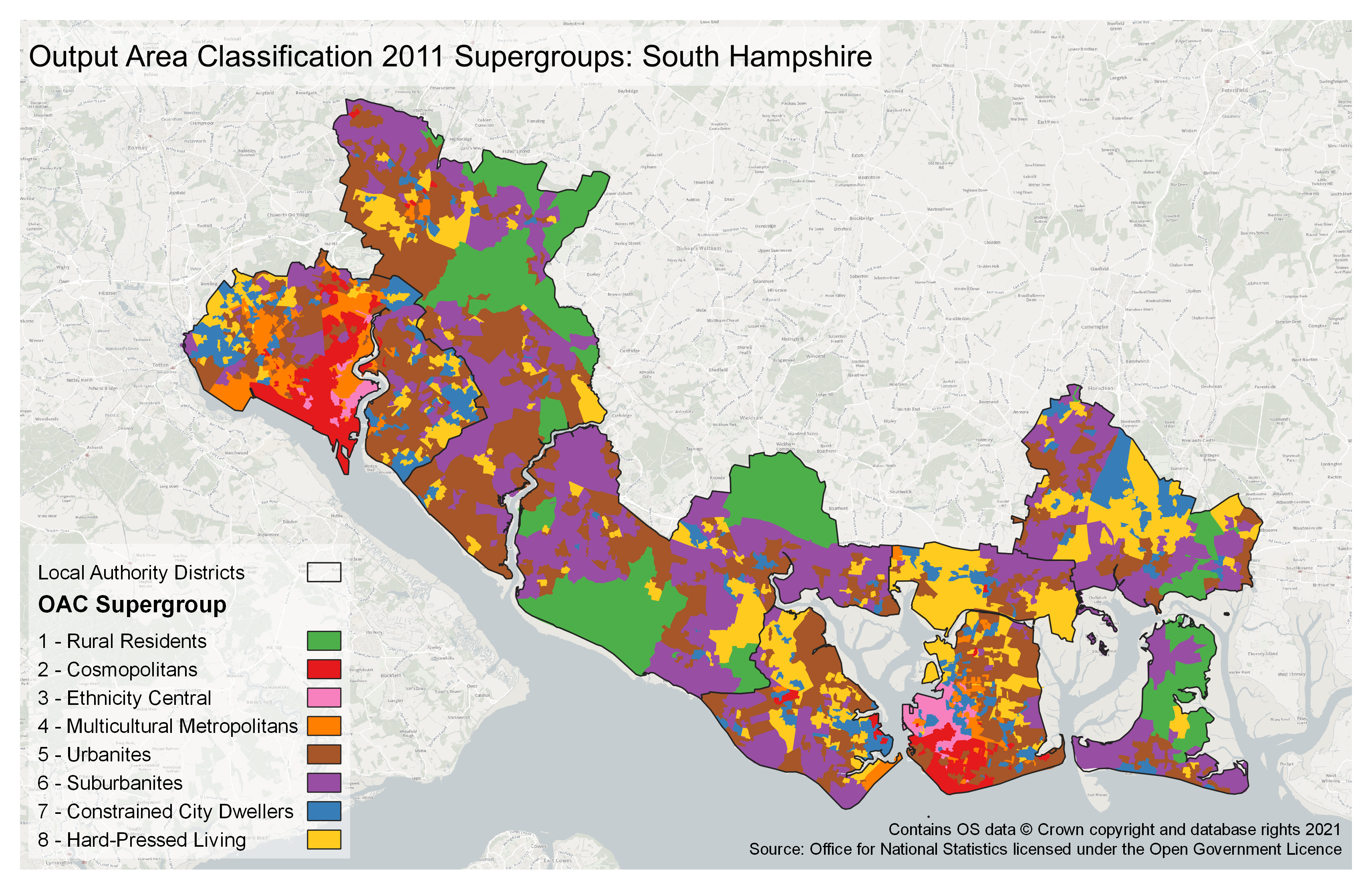
Always make sure that the chosen boundaries are best suited to the data you wish to display. For example OAs may be more detailed than necessary or too disclosive and so MSOAs may be appropriate, or the data may be reported at a geography such as a LAD and may lose meaning if aggregated up further to Counties.
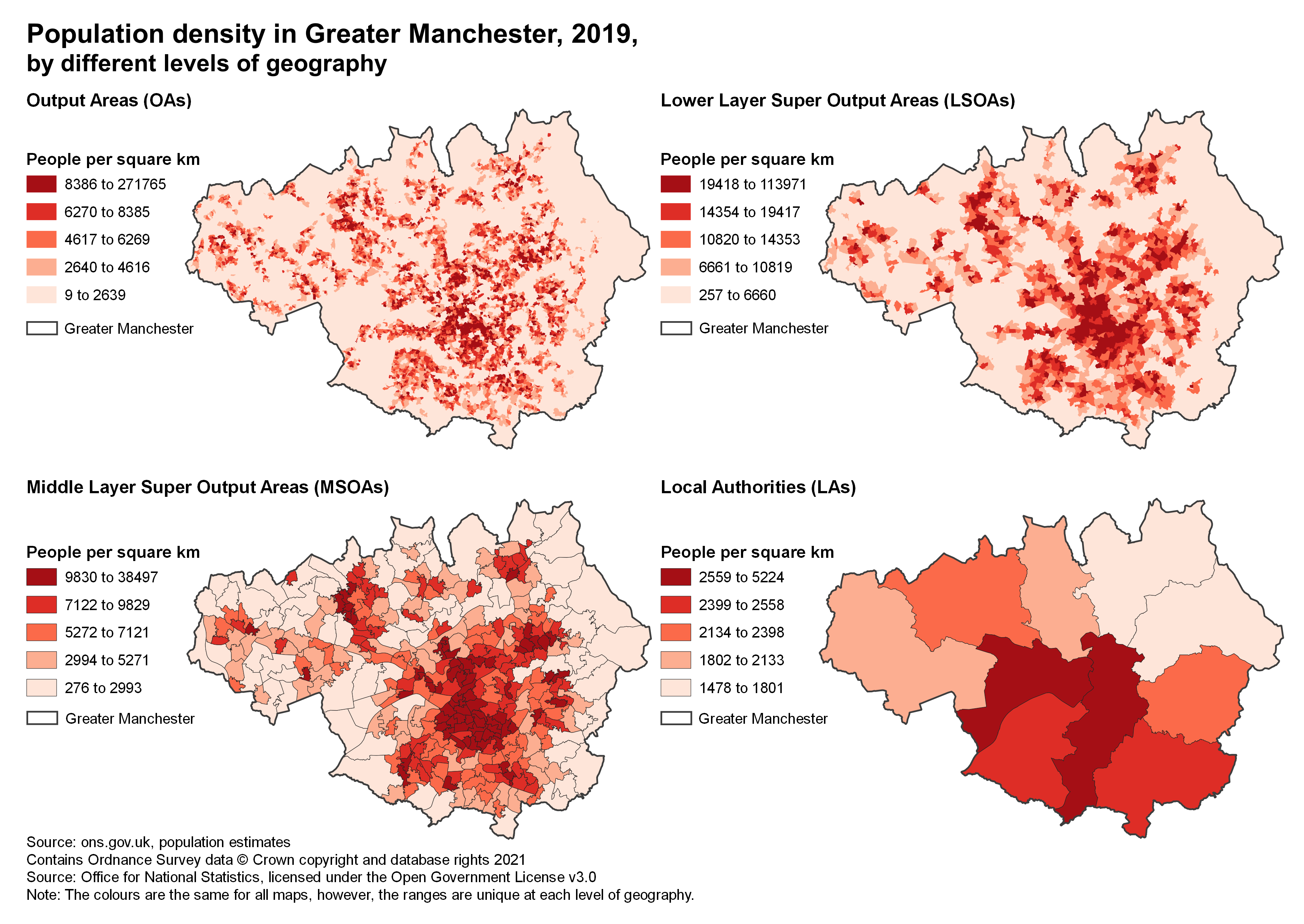
As shown above, the same data reported at different boundary levels can dramatically change the visual distribution of the data and therefore how it is interpreted.
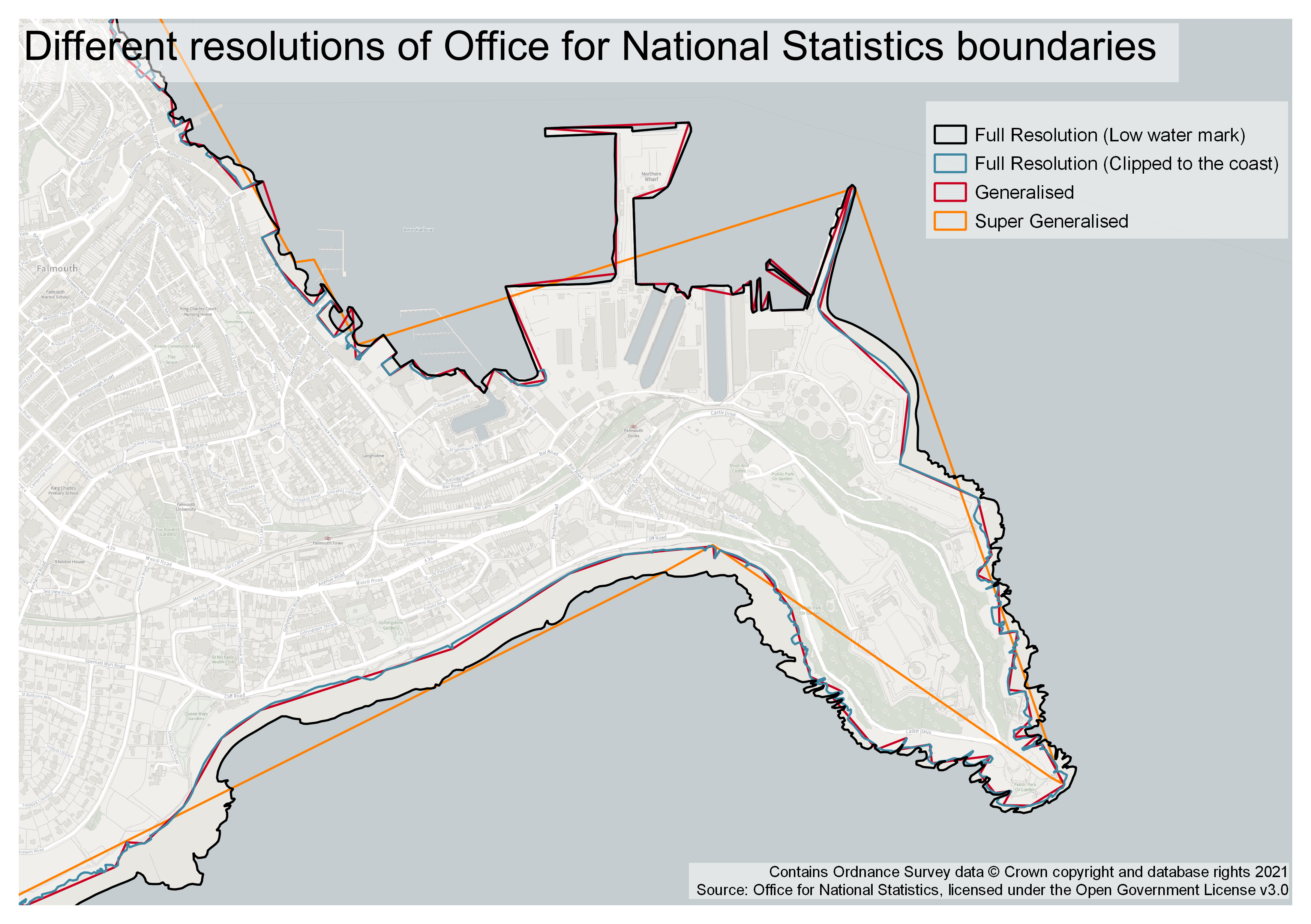
Boundary Generalisation
Boundaries from the Open Geography Portal usually come in a number of generalisations (resolutions). The image below shows what these generalisations do to the quality of the boundaries.
What generalisation you choose will depend on both what you want to visualise. A map which covers a large area with very little detail will not need a Full boundary such as BFE as this can be slow to handle in software and the detail could be distracting or hard to display. In this case, a Generalised boundary such as BGC may be better as it reduces unneeded details while preserving the overall geometry. Alternatively, there may be occasions when Super-generalised or ultra-generalised will get the job done just as well as BGC and cut out unwanted details completely.
Mixing Boundaries
Sometimes it is useful to overlay one type of boundary on top of another. Care should be taken to not make the map too crowded or to cover up the most important boundaries or colours with the overlay. The map below, for example, shows data at Middle layer Super Output Area (MSOA) level with Local Authority District (LAD) boundaries drawn on. It would be inappropriate, however, to draw MSOA boundaries over LAD level data as this might suggest detail at the MSOA level which is not actually present. Overlaying boundaries can also help give a sense of location if the primary boundaries are not commonly known by the target audience.
Colour Schemes and Symbology
Once a map type and boundary set has been chosen, the next most important property to consider is the colour scheme you will use. Different colour schemes can fundamentally change the way an audience may view and interpret a visualisation. Some colour schemes may raise an inherent bias, others may be unintuitive, and some may be unreadable for people with visual impairments like colour blindness. Choosing the right colour scheme to counter these issues is vital. There is no absolute ‘right’ or ‘wrong’, but there are choices which offer the best looking, most impactful, and most accessible maps.
Along with colour, the overall symbology must be considered. This includes what types of symbols to use for point data, line thicknesses, and map effects for emphasis.
Feature Symbology
Continuous vs Categorical Palettes
A continuous colour palette is also known as a ‘ramp’: it changes from one shade or hue to another by a gradient. The ramp used depends on the data being displayed. In most cases, continuous data which range from a minimum to a maximum should be displayed with a single colour, but across different shades, as this creates a clear visual representation of ‘minimum’ and ‘maximum’ values. For data that diverges, it is appropriate to use a diverging colour scale where different ends of the scale are displayed in different colours - this can give an idea of the directionality of the data.
Categorical palettes do not use a ramp from a minimum to a maximum, as they are used for categorical data where each class is unique. Categorical colour schemes can be difficult to get right as they often require many more classes than the 5-8 usually acceptable for continuous data. If dealing with many more classes than that, consider finding a way to ‘group’ the colours used such that similar classes share the same colour with different shades so that between-class differences stand out and more subtle detail exists within-class.
With either style of colours, it is easy to end up using colours which are hard to distinguish from each other. This happens when either the ramp used isn’t strong enough from one end to the other for the number of classes, or when too many categorical classes are used such that you run out of unique colours.
Colour Interpretation
Another thing to consider is how someone’s preconceptions about the meaning of colours might influence how they interpret a map. For instance, ‘red’ is often considered to mean ‘bad’, and so a map with a white-red colour ramp might immediately imply a scale from ‘less bad’ to ‘very bad’, regardless of the scale used. For this reason it’s good to consider the impact a colour will have in relation to the purpose of the map. In some cases, this relationship between colour and meaning can amplify a point, but on others it may be slightly misleading. In the latter case, you should try to find a neutral palette which might not invoke preconceptions.
Some maps can actually necessitate the use of colours which have a direct and commonly understood meaning. A map of physical measurement data is often best when plotted with colours associated with the physical values. A temperature map should use blues for lower temperatures and reds for higher, but only so long as the underlying data clearly ranges from accepted values of ‘cold’ and ‘hot’. Similarly, a map of tree cover as a percentage of area would probably use a green palette as this is associated with tree leaves.
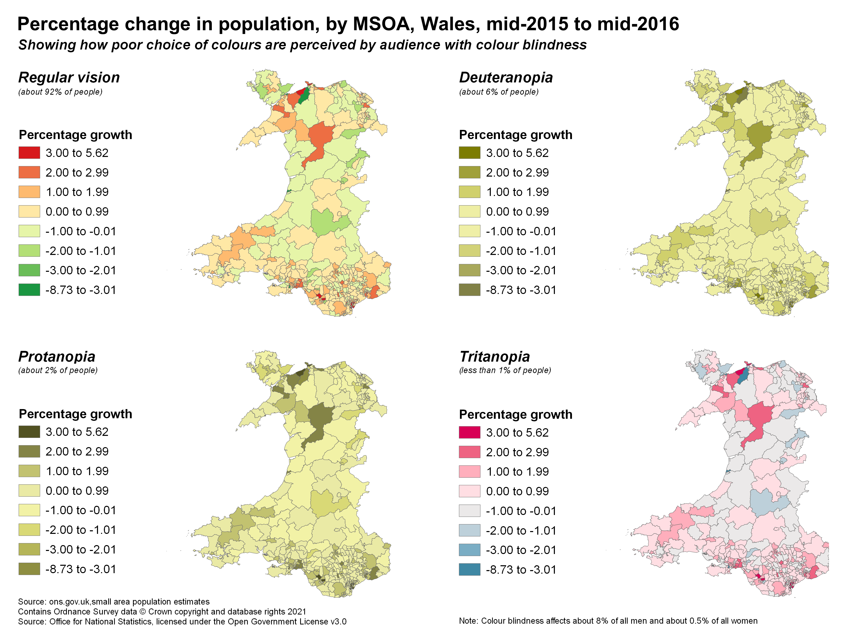
Colour and Accessibility
ColorBrewer is a website which allows you to choose a number of aesthetically pleasing palettes based on a number of criteria including the order of the data (sequential, diverging etc.), print or copy friendly, and colour-blind friendliness. Browsing through these palettes and selecting different criteria, you can see how different each palette is. Most of the palettes offer distinct and easily identifiable schemes which offer an unambiguous scale.
Accessibility is very important when making any visualisation. In maps this means choosing colour-blind friendly palettes and clearly legible and easy to comprehend text. The maps below demonstrate how colour blindness can make it difficult to differentiate between different parts of a colour scale. The first map is how someone with normal colour vision would see the map with the subsequent three panels illustrating how the same colour palette may look with some common types of colour blindness. This red-green scale is particularly infamous for being inaccessible and we recommend you avoid it in all instances! Instead, the blue-red scale is clearly differentiated across the most common form of colour-blindness.
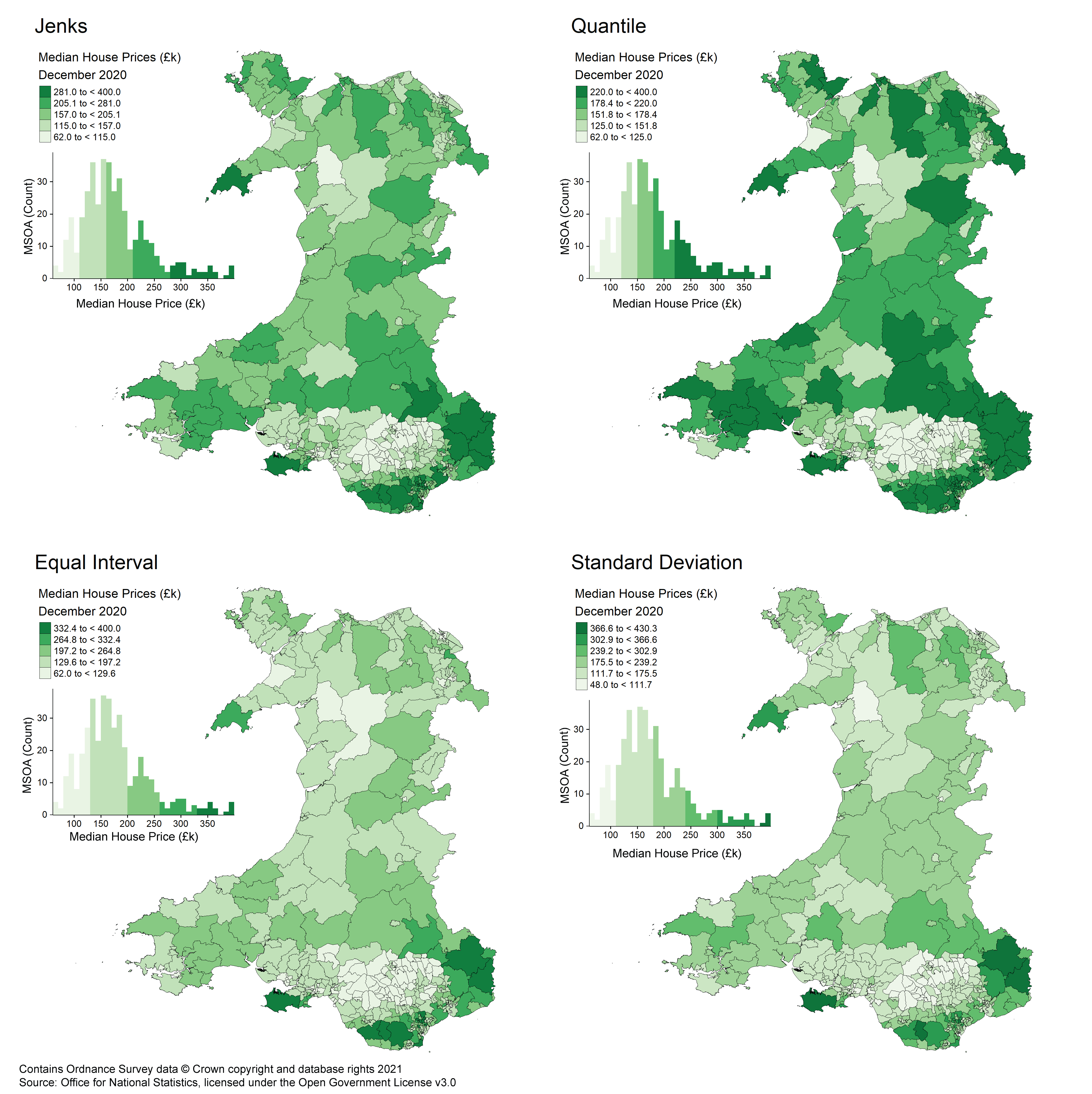
Data Breaks/Classes
The way number and distribution of colours on your map will depend on the type of ‘classes’ used to break the data up into ranges from one value to another. A number of break styles can be chosen and applied automatically in most types of GIS software. By looking at the distribution of values within your data you can assess what breaks might be appropriate. It is possible to set your break values manually, which can be useful in instances where natural breaks are perhaps too precise or not intuitive e.g. if they have too much decimal precision where rounding would be appropriate. In instances where the data contains clusters of values, Jenks (natural breaks) might be appropriate as it can automatically separate these clusters into different bins (depending on the number of classes specified). Other styles, like quantiles and equal interval, will split the data evenly and produce uniformly wide classes.
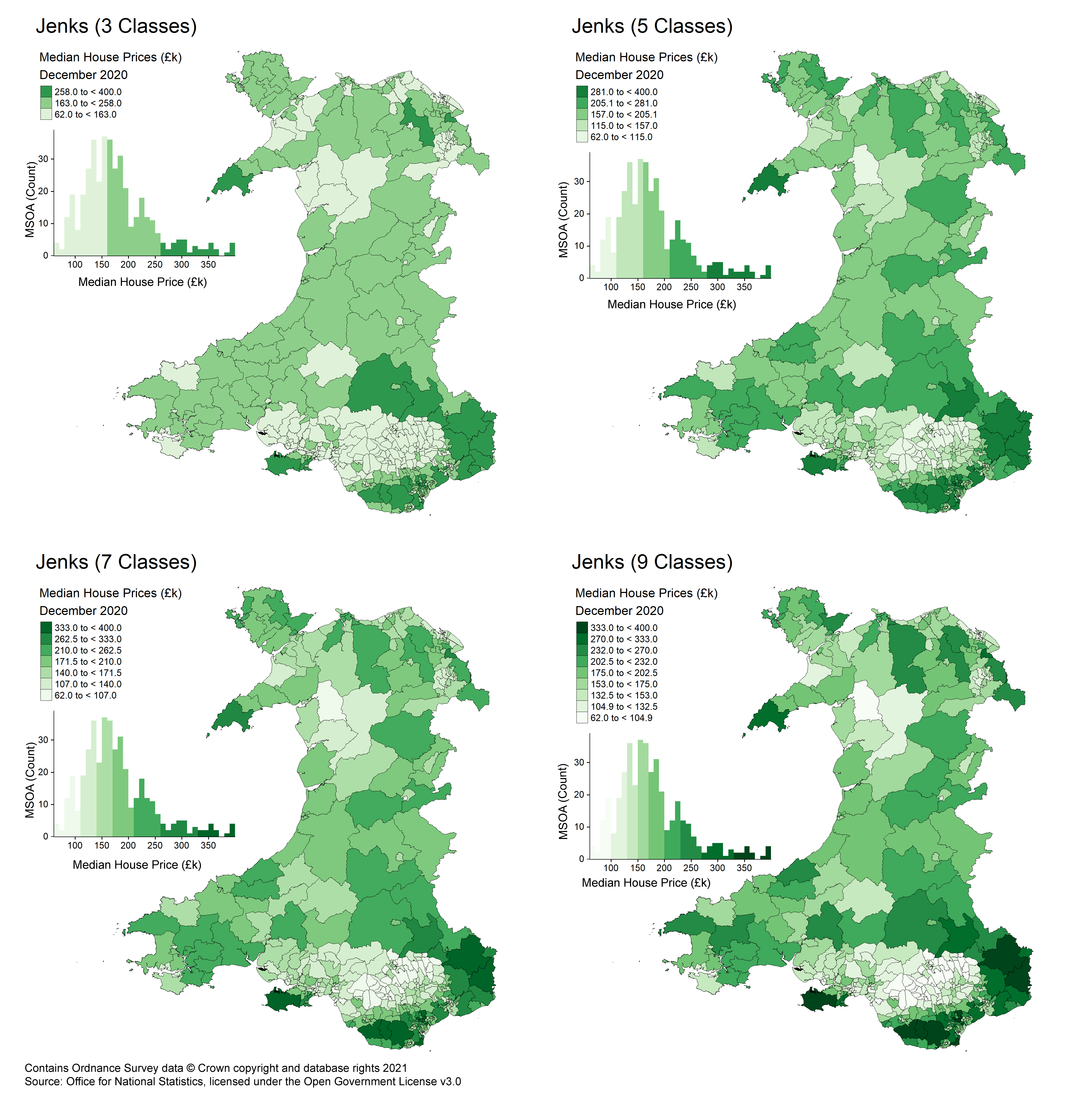
More advanced breaks, such as Standard Deviation, are more niche and are mainly appropriate in specific circumstances as they are not easily interpreted by non-experts.
The number of classes chosen will greatly impact a visualisation. Too few and you risk missing out data patterns; too many and you’ll add complexity but no additional value to the map. Generally 4 to 7 classes is appropriate for a map as this offers a good compromise between the detail visible and obvious separation of classes. In the map below you can see the impact different number of classes can have on your visualisation.
Fills, textures, and strokes
As a general rule, the fills for polygons should be solid colours. Texture or pattern fills often add unnecessary visual complexity to maps. In cases where a fill could be used to display physical features, like grassland with grass symbols, a colour or a basemap already showing that would suffice.
The ‘strokes’, outlines of polygons and points or line features, should be thin enough to not cover other features while still being clearly visible. With line features, stroke width is a useful way to denote a hierarchy of features or differentiate between them as colour is not always obvious at some stroke widths.
Line Symbology
Line features should follow a clear visual hierarchy and can be varied in colour and size to reflect their relative importance. Lines are usually differentiated by thickness and stroke style, for example, full, dashed or dotted. Think of how a roadmap will demonstrate the difference between road types; motorways will be thick and bold to stand out as the ‘highest level’ of line features, whereas small residential streets will be thinner and path features like footpaths might appear as dashed lines. Using colour can help add meaning to your map, particularly if conventional colours such as blue for water are used. This creates a visual hierarchy which is easy to identify at a glance.
Point Symbology
Most GIS software visualises points very similarly to polygons as filled-in shapes, but unlike polygons are usually scaled to be the same visual size at any map scale. Points can be differentiated by colour, size, and shape depending on the purpose of the map. In a general reference map points may be styled to look like objects, eg. boats or planes, as per the infrastructure locations they represent. A good rule of thumb for points is that they should be clearly visible at most scales without much overlap while contrasting against other features.
Map Elements
In addition to the main attribute of the map (palette, breaks, boundaries), other items can be arranged alongside to provide more information and context. Not all of these peripherals are always necessary but are contextual depending on both the type of visualisation and the intended audience.
Basemaps
Basemaps are pre-made maps which can be used to form the ‘base’ of a visualisation. These basemaps come in a number of forms ranging from standard topographical maps such a street maps or leisure maps, to aerial imagery or hybrids (think Google Maps), to possibly even heavily stylised maps useful for aesthetically pleasing backdrops.
Importantly backdrops can provide additional location detail and context which is not visible in the main data. The basemap below uses an OS Grey Raster tile to show an area with the main data overlayed.
As an ONS employee you will have access to basemaps from the Ordnance Survey Data Hub as part of the Public Sector Geospatial Agreement (PSGA). To gain access to these basemaps you simply need to sign up with a Public Sector Account at the data hub. These OS maps are highly recommended, as are their open source versions also available publicly.
Legend
A legend, or key, displays the different symbology (including colour scales) used on the map and their respective description.
Legends are generally a necessity as without them it can be difficult to determine what each symbol on the map means. Legends do not have to describe EVERY layer on the map e.g. a basemap may not need an legend entry nor would a background layer used just as a fill. For a choropleth the legend would include the colour scale used for the areas and the associated values or value ranges. A general feature map would have the symbols for places shown in the legend and what they represent.
Scale
A scale is used to assist the viewer in determining distances on the map which may not be easy to understand without context. This is usually the case when no basemap is used or for maps where distances are not easily worked out from the relative sizes of objects on the map. A number of methods are used to visualise scales. Generally, the scale bar is broken up into alternating blocks, with each block representing a given distance. The map below shows a scale with a left and right side: The left side shows divisions of a KM, while the right side shows the extent of a whole KM.
A scale can be necessary on a map for two reasons:
- When there are no contextual clues in the map to give a sense of scale
- When the data shown is based on a measure of distance
The latter reason is an important consideration as it can give much-needed additional context to the distribution of the data.
Compass
A compass shows the direction of North relative to the map. A compass is a lesser-used feature in most data visualisations as it’s often clear that maps default to ‘up’ as north. However, there are times when this may not be the case such as when the map is rotated, or the map may be taken in isolation away from the context which would otherwise signify. If the area shown in the map is unfamiliar to the viewer, they may also wish to have a reference to north.
While many will think of a fancy compass rose such as on old-fashioned globes which show north-east-south-west, it is perfectly acceptable to use a compass which only shows north. In the example below this is represented with a simple arrow pointing up. If the displayed map was actually offset at a certain angle from north, the arrow would also be rotated to this angle.
![]()
Graticules
Graticules are lines and/or dashes within and along the edge of a map which display X and Y coordinates. Graticules are commonly seen on military maps where a combination of distance grid and decimal degrees longitude and latitude are shown.
Graticules are rarely used in basic visualisations however they are particularly important in some situations. For example, some large-scale maps such as those of entire continents can often be enhanced with the use of graticules: either as dashes on the edge of the map or lines going across it. Similarly, the mapping of any data which is known to vary with latitude and longitude can use a graticule to make this explicit.
The graticules should be unintrusive however, so try not to use thick or bold lines and instead use thin lines with a colour which blends well with the rest of the map.
Text
Text is very important for mapping. It provides a description of what the map represents and can be expanded into a number of areas to improve the quality of the map through annotations or additional information.
Much like any other document, text should follow a font size hierarchy to help draw the eye to certain parts of the map and to make it easier to see what parts are and are not related.
Labels
Labels are pieces of text placed on the map itself to identify individual features or groups of features. Labels can be placed in a number of ways:
- Alongside the feature
- Around the feature
- Entirely within the feature
- Across the feature matching its shape
Which label to use depends on several factors. A dense map may only fit a few labels before becoming messy. Labels for a geography which does not easily fit the label might need the text to move along the feature. When following the geometry of a feature, labels should flow left to right, bottom to top (see map below which contains multiple label types). This ensures the label is legible. Additionally, labels should not cross over the boundary of the parent feature into another as this could suggest it belongs to multiple features.
Leader lines can be a useful way to pull labels away from a cluttered area while still maintaining the label functionality. You can also use number annotations to reference labels which are provided in a list to the side of the map. These are harder to read and less intuitive so should be used as a last resort when alternatives are not possible.
It is possible to effectively utilise multiple labelling techniques on one map, but we suggest keeping this to a minimum for ease of understanding.
Title
The title is the most important single piece of text on a map. A title should stand out and be clearly visible at the top. The title should be descriptive enough that a viewer can clearly glean the purpose of the map from what it says. Conversely, the title is not in and of itself a piece of descriptive text and so should be made concise so a viewer could read and understand it quickly.
Descriptive Text
As the title cannot be used to describe EVERYTHING about a map, some accompanying descriptive text could be useful. This should be placed alongside the map and should give additional details about specific points of the visualisation. For example, a descriptive text box could be used to briefly explain the distribution of the data in a choropleth, or multiple boxes could be added with lines pointing to clusters of points, or it could simply give additional context for the purpose of the map.
Regardless of how the text is used, it should be clear and relate directly to the map.
Insets
Insets are smaller maps within the layout of a large map, used to show details which may otherwise be hard to see in the main map. These are often used to show dense urban areas e.g. Greater London, in detail or to include features geographically separated from the main features of the map by positioning them closer e.g. the Shetland Isles which are far from Great Britain and would result in a bad map scale if shown in their actual position.
Multiple insets can be used on the same map to show off different areas of interest in greater detail. However, this can become cluttered and consideration should be taken as to if an entirely new page/map should be used for the inset feature instead.
General Map Design
This section will cover some other, more general aspects of map design, particularly arranging the layout of a map and some underlying considerations towards the purpose of the map.
Layout
The layout of a map, that is the layout of all items on a page or image from the map itself to text and other additional features, is important for both the aesthetics of the map and ease of use.
When arranging items, it’s important to consider a few things: what items are part of the map and what items describe the map. As a general rule, items which are actually a part of the map should clearly stand out. Boundaries should be obvious, colours clear, symbols highly visible.
Arranging items
When arranging items around the map, be sure to keep the focus on the map itself. Generally the map should take up the most area with other features like text, legend, scale being placed around or on the map without covering data. For items placed outside of the main map area, these should be placed such that they follow the ‘reading order’: look at the map, then refer to descriptions and other items after. Items placed in the map area need to be unintrusive but clear for example a scale should be place such that it’s on the map for direct reference but is not intruding upon key map features like coloured areas or labels.
Telling a Story
Finally, we come to a crucial question you should ask yourself when designing your map. The rest of this tutorial has guided you in creating a map which accurately displays data and is easy to interpret. While making a visualisation, however, there is always room for changes beyond the suggestions here, depending on what story you are trying to tell with the map. Ultimately, the map should clearly convey what the data means within a geographic context. Not all data necessarily needs a map, but a great map with a good story can often make a stronger point than the raw data or a series of graphs on their own.
So while designing your map, continuously ask “What story am I trying to tell? Does this map succeed in telling it?”. A good map will achieve this through a good balance of accuracy and aesthetics.
Exercise: Improving a Bad Map
This section will showcase two maps, each of which is presented as “bad” and “good”. The “bad” maps have fundamental flaws which make them misleading or hard to use. Take a look at the maps with a critical eye and the information you’ve just read to try and work out what’s wrong with them. Think about how you could change them to improve them. Once you’ve done this look at the discussion and the ‘good’ version. Remember, while there are some things which are outright wrong and will be misleading to the viewer (eg. plotting raw counts on a choropleth) there are a lot of subjective choices when making a map too, so critiquing other maps is a useful skill to develop to apply to the maps that you make.
All the maps in this section were created specifically for these examples and are not representations of official maps.
Bad Maps
Example 1
Example 2
Example 3
Example 4
Improved Versions and Discussion
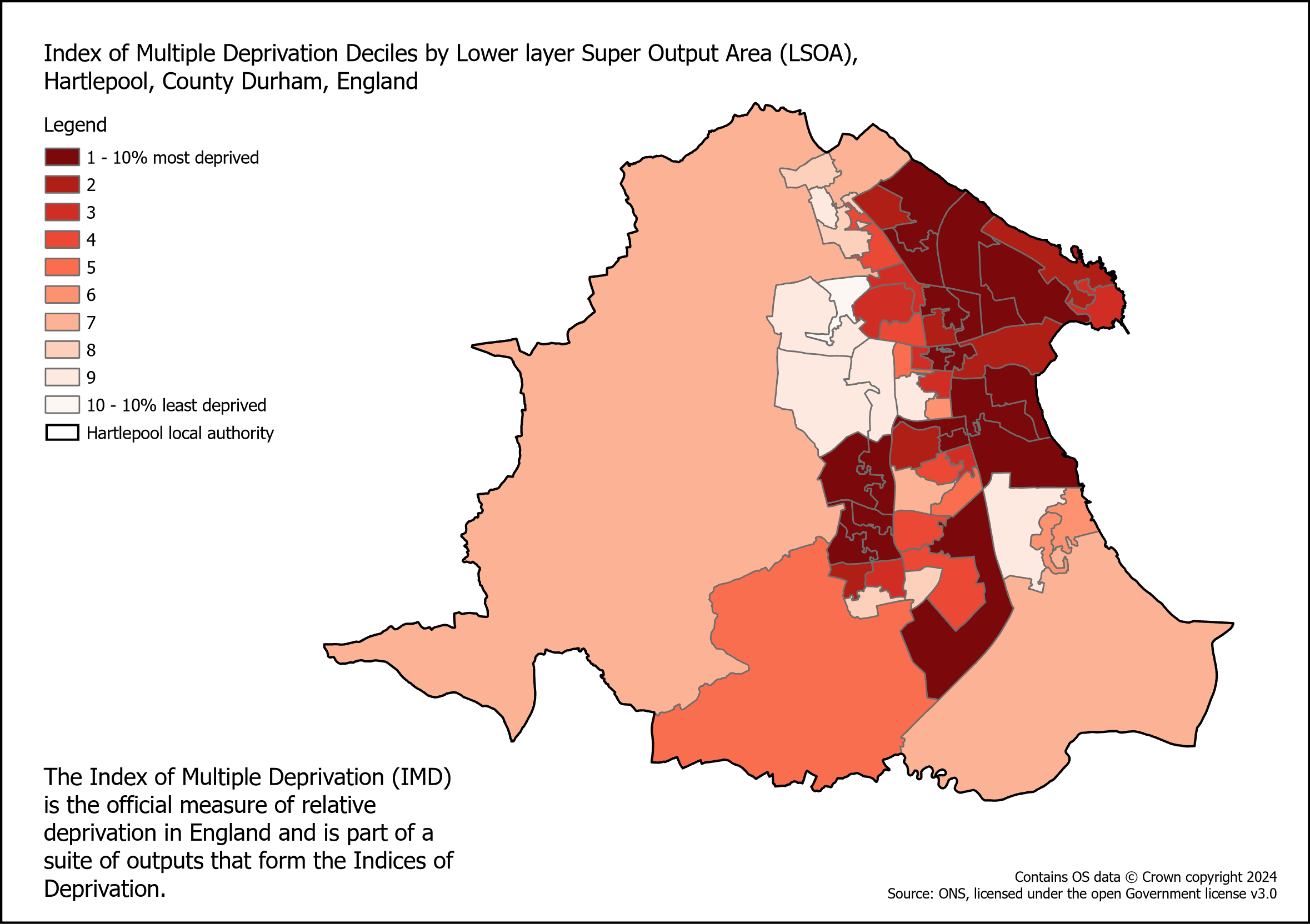
Example 1
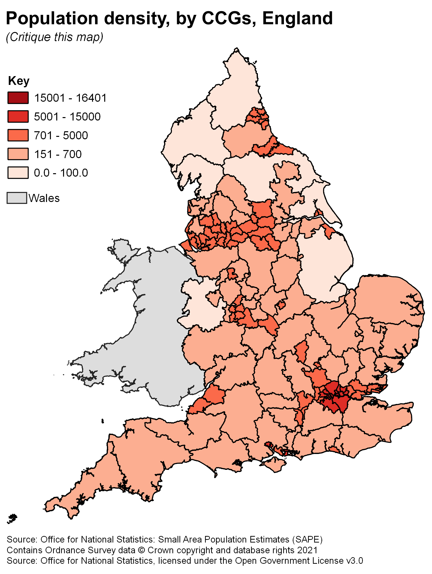
The bad map looks as if it’s plotted raw counts of people onto a choropleth map - a big mistake as it’s very misleading due to the variable sizes of areas. However, the key doesn’t actually tell us the unit of the data, and the title of the map reports that the map is ‘population density’ so it’s quite misleading and confusing all round.
The classes used to break the data are bad because most of the data falls into the same three categories and you can’t really discern any particular pattern from it. It would be better to investigate other types of breaks for this map.
The thickness of the boundaries is unnecessarily large and the solid black colour makes them stand out a lot. The boundaries aren’t a huge feature of this map so it would be better to have a less obtrusive colour like a medium shade of grey, and a thinner line stroke too.
Here’s an improved version of the map
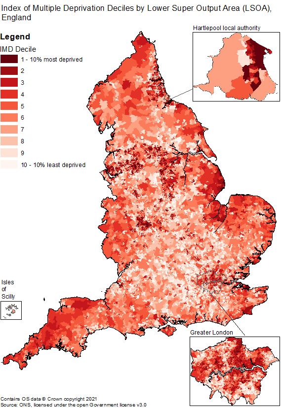
Example 2
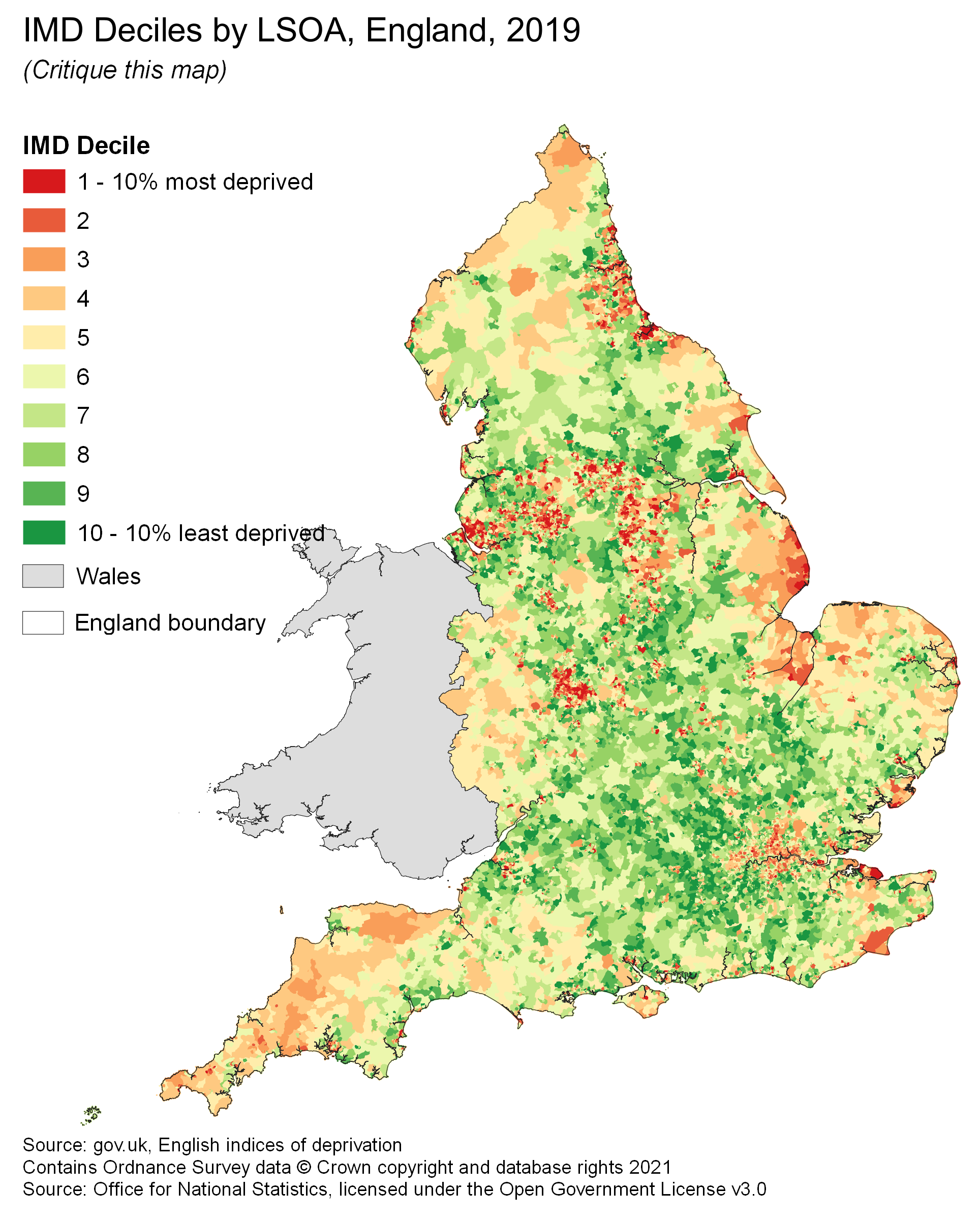
This map plots Index of Multiple Deprivation decile ranking on a divergent colour scale which is not wrong per se, but seems a bit misleading as this is a continuous measure.
The red-green colour ramp is not accessible to people with the most common type of colour blindness and absolutely must be changed for something more accessible.
Text in the legend overlaps the map data, which looks messy and might cover up useful information - this should be moved to ensure there is no overlap.
Finally, the title uses an abbreviation (IMD) which people may not be familiar with - it’s best practice to spell out abbreviations in full the first time you use them.
Here’s an updated version of this map
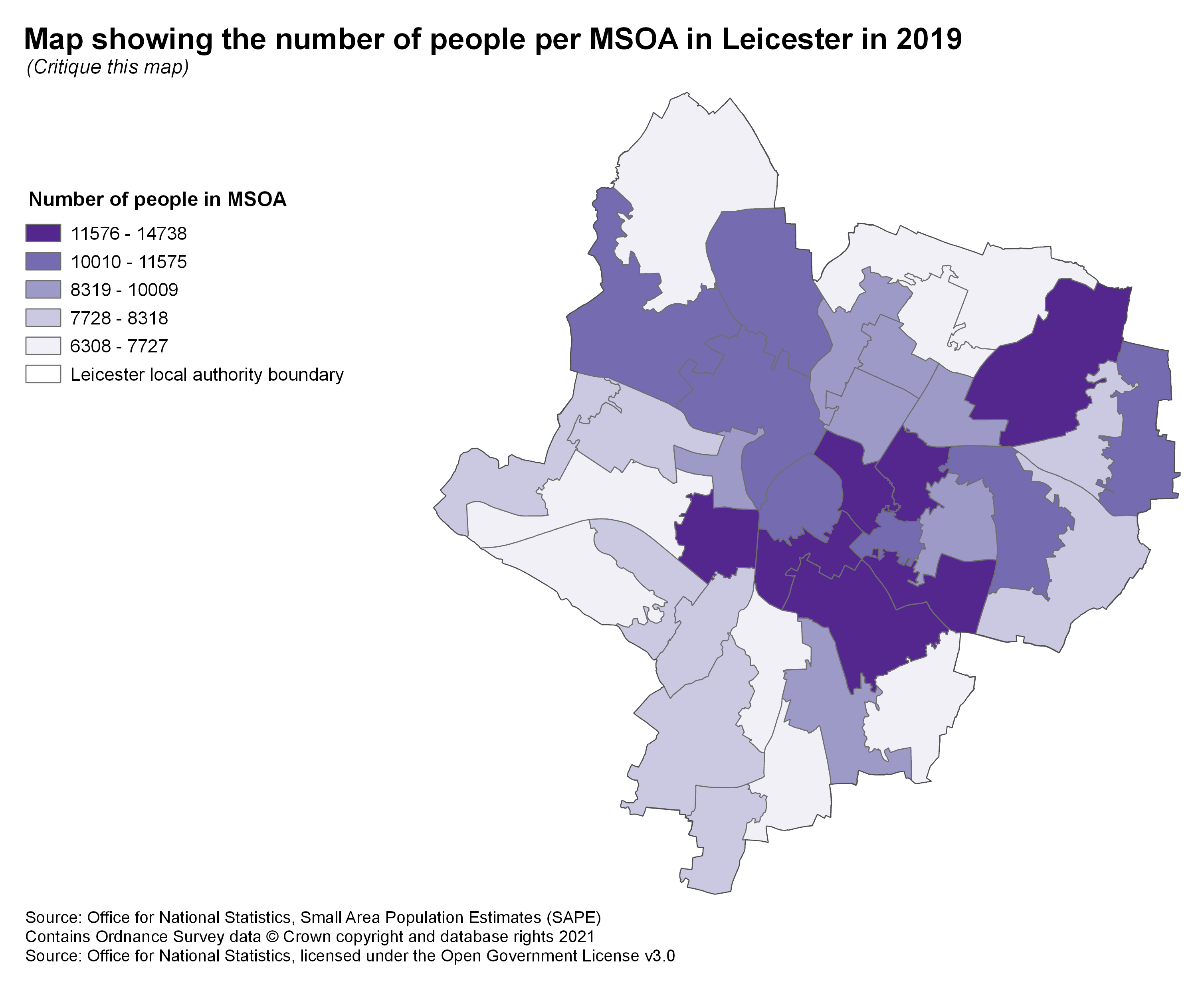
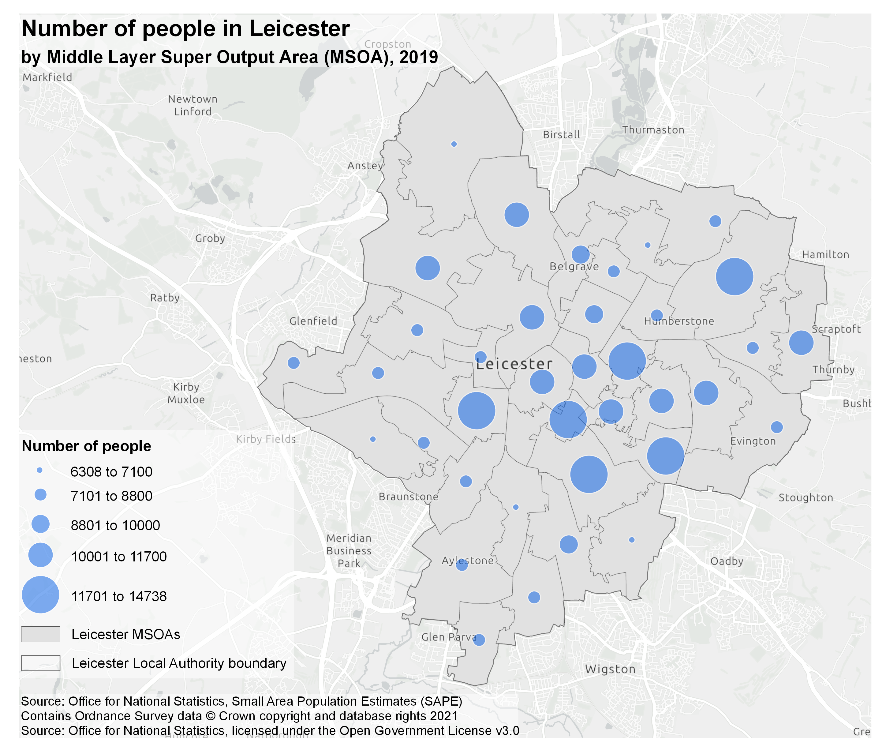
Example 3
This map plots raw counts on a choropleth which is a big no-no! These need to be normalised, in this context, probably by area. The key and units should be updated to reflect this. Alternatively, a different type of map should be used to plot raw counts.
The geographical context of this map is a bit vague - if someone doesn’t know where Leicester is then they wouldn’t know what any of this area refers to. This can be improved by adding a basemap or a small context inset map.
The boundaries aren’t a highly important feature of this map, but they get lost alongside the medium purple - a suitably contrasting colour needs to be selected for this. Also, the local authority boundary is styled the same as the MSOA boundaries which makes it unclear exactly what you’re looking at.
To improve this map we’ve selected a proportional symbol map and have changed the symbology to something much clearer, with a better geographical context through the base map and labels. You can also see a difference in the boundaries, with the LA boundary being slightly thicker than the MSOA boundaries to distinguish the hierarchy.
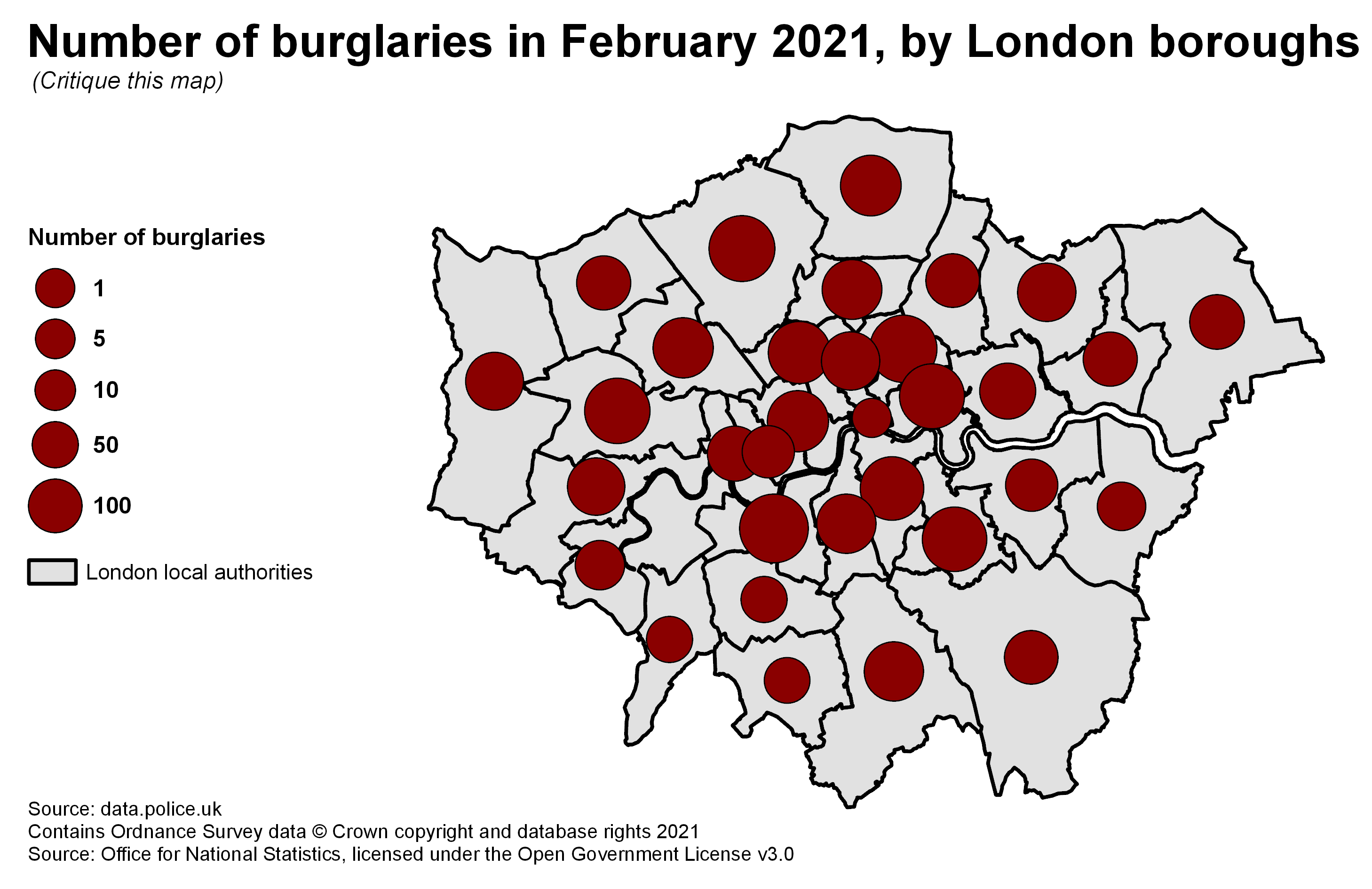
Example 4
This map makes it really hard to see the spatial distribution of burglaries because the size of the symbols is so similar and the geography chosen is so large. To better illustrate the pattern a smaller geography was chosen on the update (MSOAs not London Boroughs) and a better distribution of sizes was chosen so the circles are easily distinguishable.
Some areas of the map don’t have data recorded, but this is hard to spot if you don’t look very closely. It’s also tricky to see in the centre where there’s quite a clutter of points. On the improved map, the use of MSOAs, a bigger range in symbol sizes, and a slight transparency to the layer helps all points be visible. Areas of no data are highlighted in a different shade of grey rather than with a symbol.
Aesthetically, this map doesn’t look very pleasant. The boundaries are very thick and heavy, and the brown colour scheme isn’t very nice. Something more aesthetically pleasing could be chosen!